Sticky Postings
All 242 fabric | rblg updated tags | #fabric|ch #wandering #reading
By fabric | ch
-----
As we continue to lack a decent search engine on this blog and as we don't use a "tag cloud" ... This post could help navigate through the updated content on | rblg (as of 09.2023), via all its tags!
FIND BELOW ALL THE TAGS THAT CAN BE USED TO NAVIGATE IN THE CONTENTS OF | RBLG BLOG:
(to be seen just below if you're navigating on the blog's html pages or here for rss readers)
--
Note that we had to hit the "pause" button on our reblogging activities a while ago (mainly because we ran out of time, but also because we received complaints from a major image stock company about some images that were displayed on | rblg, an activity that we felt was still "fair use" - we've never made any money or advertised on this site).
Nevertheless, we continue to publish from time to time information on the activities of fabric | ch, or content directly related to its work (documentation).
Tuesday, February 27. 2024
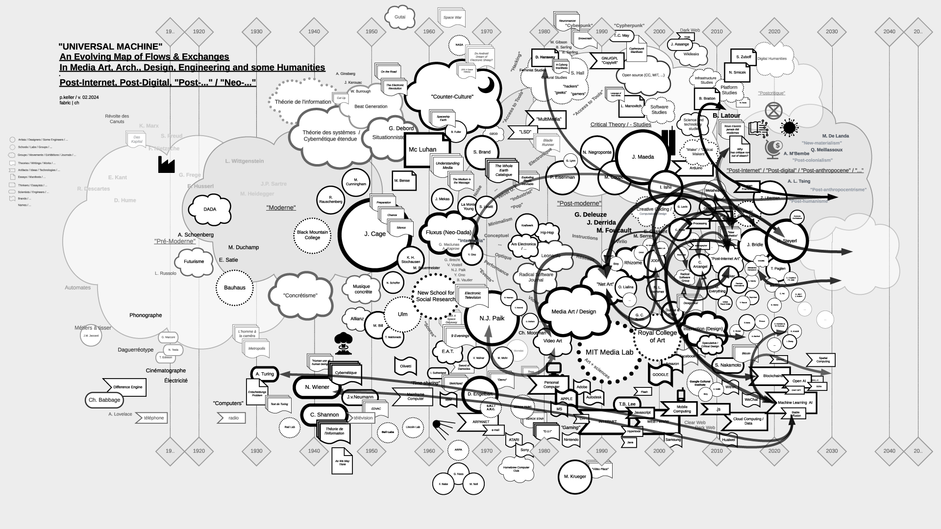
"Universal Machine": historical graphs on the relations and fluxes between art, architecture, design, and technology (19.. - 20..) | #art&sciences #history #graphs
Note (03.2024): The contents of the files (maps) have been updated as of 02.2024.
-
Note (07.2021): As part of my teaching at ECAL / University of Art and Design Lausanne (HES-SO), I've delved into the historical ties between art and science. This ongoing exploration focuses on the connection between creative processes in art, architecture, and design, and the information sciences, particularly the computer, also known as the "Universal Machine" as coined by A. Turing. This informs the title of the graphs below and this post.
Through my work at fabric | ch, and previously as an assistant at EPFL followed by a professorship at ECAL, to experience first hand some of these massive transformations in society and culture.
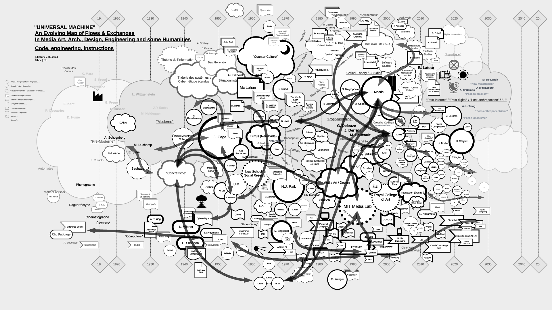
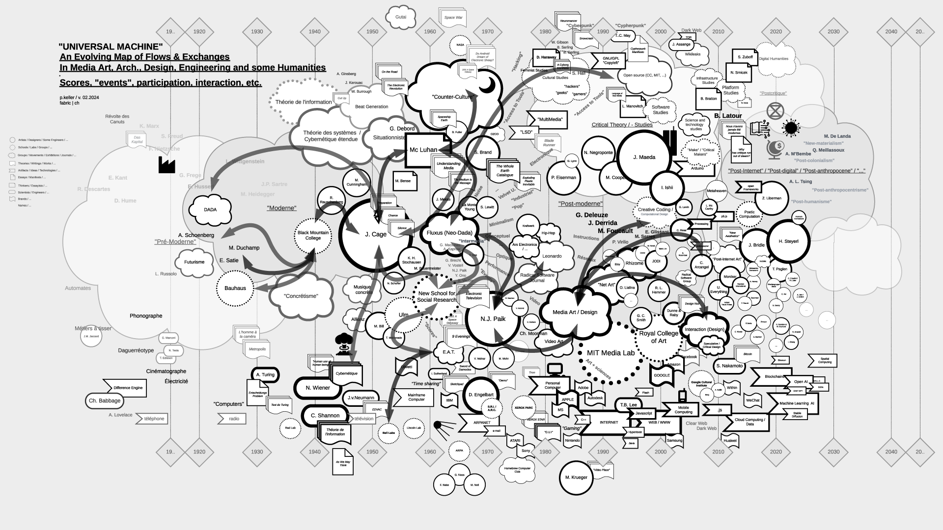
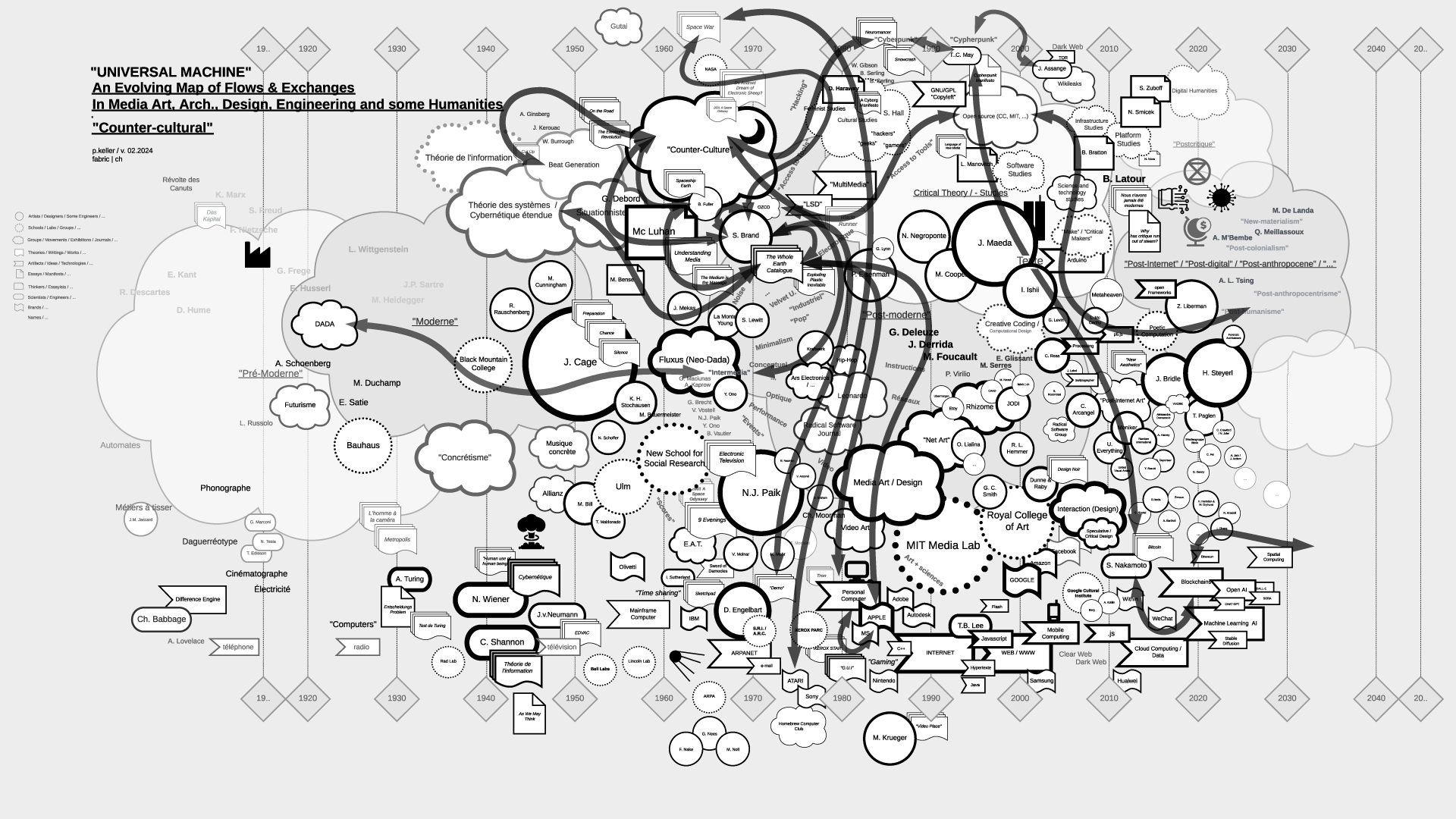
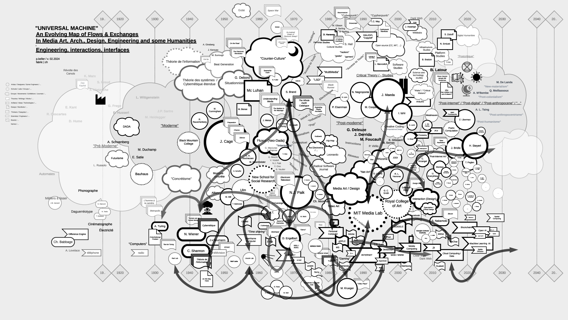
Thus, in my theory courses, I've aimed to create "maps" that aid in comprehending, visualizing, and elucidating the flux and timelines of interactions among individuals, artifacts, and disciplines. These maps, imperfect and constrained by size, are continuously evolving and open to interpretation beyond my own. I regularly update them as part of the process.
Yet, in the absence of a comprehensive written, visual, or sensitive history of these techno-cultural phenomena as a whole, these maps serve as valuable approximation tools for grasping the flows and exchanges that either unite or divide them. They offer a starting point for constructing personal knowledge and delving deeper into these subjects.
This is precisely why, despite their inherent fuzziness - or perhaps because of it - I choose to share them on this blog (fabric | rblg), in an informal manner. It's an invitation for other artists, designers, researchers, teachers, students, and so forth, to begin building upon them, to depict different flows, to develop pre-existing or subsequent ideas, or even more intriguingly, to diverge from them. If such advancements occur, I'm keen on featuring them on this platform. Feel free to reach out for suggestions, comments, or to share new developments.
...
It's worth mentioning that the maps are structured horizontally along a linear timeline, spanning from the late 18th century to the mid-21st century, predominantly focusing on the industrial period. Vertically, they are organized around disciplines, with the bottom representing engineering, the middle encompassing art and design, and the top relating to humanities, social events, or movements.
Certainly, one might question this linear timeline, echoing the sentiments of writer B. Latour. What about considering a spiral timeline, for instance? Such a representation would still depict both the past and the future, while also illustrating the historical proximities of topics, connecting past centuries and subjects with our contemporary context in a circular manner. However, for the time being, and while recognizing its limitations, I adhere to the simplicity of the linear approach.
Countless narratives can emerge as inherent properties of the graphs, underscoring that they are not their origins but rather products thereof.
...
The selection of topics (code, scores-instructions, countercultural, network-related, interaction, "post-...") currently aligns with the themes of my teaching but is subject to expansion, possibly toward an underlying layer revealing the material conditions that underpinned and facilitated the entire process.
In any case, this could serve as a fruitful starting point for some further readings or perhaps a new "Where's Waldo/Wally" kind of game!
Via fabric | ch
-----
By Patrick Keller
Rem.: By clicking on the thumbnails below you'll get access to HD versions.
"Universal Machine", main map (late 18th to mid 21st centuries):
Flows in the map > "Code":
Flows in the map > "Scores, Partitions, ...":
Flows in the map > "Countercultural, Subcultural, ...":
Flows in the map > "Network Related":
Flows in the map > "Interaction":
Flows in the map > "Post-Internet/Digital, "Post -..." , "Neo -...", ML/AI":
...
To be continued (& completed) ...
Thursday, July 24. 2014
What Else Could Smart Contact Lenses Do? | #vision
-----
Besides health tracking, contact lens technology under development could enable drug delivery, night vision, and augmented reality.
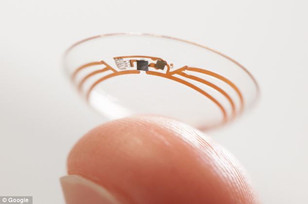
Last week Google and Novartis announced that they’re teaming up to develop contact lenses that monitor glucose levels and automatically adjust their focus. But these could be just the start of a clever new product category. From cancer detection and drug delivery to reality augmentation and night vision, our eyes offer unique opportunities for both health monitoring and enhancement.
“Now is the time to put a little computer and a lot of miniaturized technologies in the contact lens,” says Franck Leveiller, head of research and development in the Novartis eye care division.
One of the Novartis-Google prototype lenses contains a device about the size of a speck of glitter that measures glucose in tears. A wireless antenna then transmits the measurements to an external device. It’s designed to ease the burden of diabetics who otherwise have to prick their fingers to test their blood sugar levels.
“I have many patients that are managing diabetes, and they described it as having a part-time job. It’s so arduous to monitor,” says Thomas Quinn, who is head of the American Optometric Association’s contact lens and cornea section. “To have a way that patients can do that more easily and get some of their life back is really exciting.”
Glucose isn’t the only thing that can be measured from tears rather than a blood sample, says Quinn. Tears also contain a chemical called lacryglobin that serves as a biomarker for breast, colon, lung, prostate, and ovarian cancers. Monitoring lacryglobin levels could be particularly useful for cancer patients who are in remission, Quinn says.
Quinn also believes that drug delivery may be another use for future contact lenses. If a lens could dispense medication slowly over long periods of time, it would be better for patients than the short, concentrated doses provided by eye drops, he says. Such a lens is not easy to make, though (see “A Drug-Dispensing Lens”).
The autofocusing lens is in an earlier stage of development, but the goal is for it to adjust its shape depending on where the eye is looking, which would be especially helpful for people who need reading glasses. A current prototype of the lens uses photodiodes to detect light hitting the eye and determine whether the eye is directed downward. Leveiller says the team is also looking at other possible techniques.
Google and Novartis are far from the only ones interesting in upgrading the contact lens with such new capabilities. In Sweden, a company called Sensimed is working on a contact lens that measures the intraocular pressure that results from the liquid buildup in the eyes of glaucoma patients (see “Glaucoma Test in a Contact Lens”). And researchers at the University of Michigan are using graphene to make infrared-sensitive contact lenses—the vision, as it were, is that these might one day provide some form of night vision without the bulky headgear.
A Seattle-based company, Innovega, meanwhile, has developed a contact lens with a small area that filters specific bands of red, green, and blue light, giving users the ability to focus on a very small, high resolution display less than an inch away from their eyes without interfering with normal vision. That makes tiny displays attached to glasses look more like IMAX movie screens, says the company’s CEO, Steve Willey. Together, the lens and display are called iOptik.
Plenty of challenges still remain before we’re all walking around with glucose-monitoring, cancer-detecting, drug-delivering super night vision. Some prototypes out there are unusually thick, Quinn says, and some use traditional, rigid electronics where clear, flexible alternatives would be preferable. And, of course, all will have to pass regulatory approval to show they are safe and effective.
Jeff George, the head of the Novartis eye care division, is certainly optimistic about Google’s smart lens. “Google X’s team refers to themselves as a ‘moon shot factory.’ I’d view this as better than a moon shot given what we’ve seen,” he says.
Friday, July 18. 2014
Data Cuisine, food as data expression | #data #food
Via WMMNA
-----
Tuesday, March 12. 2013
Chinese Physicists Build Ghost Cloaking Device
-----
A working invisibility cloak that makes one object look like ghostly versions of another has been built in China.
Illusion cloaks that make one object look like another are a fascinating type of invisibility device. The general idea is that such a device would make an apple look like a banana or a fighter plane look like an airliner. Clearly this would have important applications.
But while materials scientists have made great strides in building ordinary invisibility cloaks that work in the microwave, infrared and optical parts of the spectrum, making illusion cloaks is much harder. That’s because the bespoke materials they rely on require manufacturing techniques that seem like a distant dream.
Today, Tie Jun Cui and buddies at Southeast University in Nanjing, China, say they’ve designed and built a practical alternative to illusion cloaks, which they call a “ghost cloak”.
Conventional illusion cloaks rely on a two stage process. The first is a kind of invisibility stage which distorts incoming light to remove the scattering effect of the cloaked object, an apple for example. The second stage then distorts the scattered light to make it look as if it has been scattered off another object, a banana, for example. The result is that the apple ends up looking like a banana.
But materials that can perform this two-stage process are too demanding to make with current techniques.
So Tie Jun Cui and co have developed a single stage process that achieves a slightly different effect. Their idea is to do away with the first stage that makes the apple invisible.
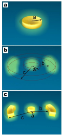
Instead, their device takes the light scattered from the apple and distorts it to look like something else such as a banana. The symmetry of the effect–light is scattered on both sides of the apple–mean that this approach produces two “ghost” bananas, one on each side of the apple. The technique does not remove the apple entirely but distorts it, making it appear much smaller.
So the result is that the apple is changed into a much more complex picture that is significantly different from the original.
The big advantage of this approach is that it can be achieved now with existing technology. Tie Jun Cui and co first simulate the effect of their ghost cloak on a computer model.
They then go on to build a working prototype using concentric cylinders of split ring resonators that operates in 2 dimensions. They say that the results of their tests on this device closely match the results of the simulation.
That’s an interesting advance. The ability to distort and camouflage objects is clearly useful. However, an important question is whether the distortion that this device offers is good enough for any practical applications. Tie Jun Cui and co mention “security enhancement” but just how effective this would be when the original object is still visible, albeit in shrunken form, is debatable.
It may be that there are ways of improving the performance so it’ll be interesting to see what this team comes out with next.
Ref: arxiv.org/abs/1301.3710: Creation of Ghost Illusions Using Metamaterials in Wave Dynamics
Related Links:
Friday, May 25. 2012
What You See Is What You Are
Via Owni.eu
-----
By Paule d'Atha
(...)
A little “data art” to finish with Marcin Ignac, a Danish artist, programmer and designer. In his project Every Day of My Life, he visualises every time he has used his computer in the past 30 months.
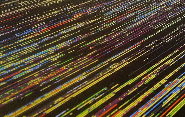
Each line represents a day and each colour block, the main application opened during that time. The black gaps are times when the computer was switched off. It’s particularly interesting to see, year after year, the frequency of black-out areas.
Friday, March 30. 2012
NASA Perpetual Ocean: The Ocean Surface Currents around the World
-----
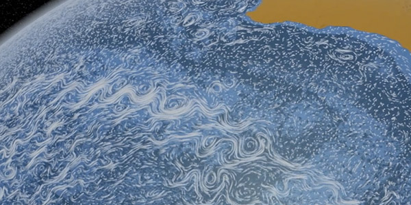
Sometimes, particle animations work. Perpetual Ocean by NASA This visualization shows ocean surface currents around the world during the period from June 2005 through Decmeber 2007.
Interestingly, the visualization does not include any narration or annotations. Instead, the goal was to use ocean flow data to create a simple, visceral experience. The data was based on a high resolution model of the global ocean and sea-ice, that is able to capture ocean eddies and other narrow-current systems which transport heat and carbon in the oceans.
You can either hit your bandwidth allowance by downloading the 2GB versions at the NASA website, or watch the somewhat smaller, yet still HD version, below.
Via @aaronkoblin.
-----
And something similar with the wind:

Personal comment:
Beautiful climate's fluxes patterns. Change their scale (to the scale of a town? a house?) and just think about inhabiting them.
Friday, November 04. 2011
Semiconductor: 20Hz
Via It's NIce That
-----
de James Cartwright
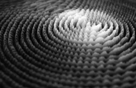
Data is really dry. Anything that can be put into an impenetrable spreadsheet and turned into an equally incomprehensible graph or bar-chart is usually best left well alone. But Semiconductor think not, in fact they ruddy love the data – so much so in fact that they’ve actively sought out data from the The Canadian Space Agency to utilise in their latest project. 20Hz is an audiovisual maelstrom of an animation that takes raw data from electromagnetic storms and re-interprets it with sound and light, allowing us just a little insight into the weather systems of the cosmos. It’s pretty stunning.
Tuesday, August 09. 2011
High Altitude
Via NextNature
-----
The rock formations in the High Altitude photo series don’t exist physically, yet they are very present in our society of simulations. The photos visualize the development of the leading global stock market indices over the past 20-30 years.
Each stock market index, such as the Dow Jones (shown above), Nikkei, Nasdaq or the more specific Lehman Brothers stock quote downfall, corresponds to a impeccably rendered unique mountain range. Photographer Michael Najjar used the images captured during his trek to Mount Aconcagua (6,962m) as the basis of the high altitude data visualizations.

Lehman 1992-2008

Nasdaq 1980-2009

Nikkei 1966-2009

Hangseng 1980-2009

Dax 1980-2009

MSCI 1980-2009

Bovespa 1993-2009

RTS 1995-2009
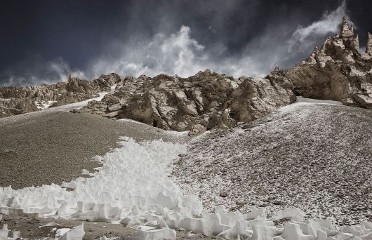
Senex 1983-2009
Personal comment:
In a time when stock data has so much (bad) impact on our daily lives, natural landscape of data that look half beautiful and half hazardous... as seen also on the cover of one of the latest book about data design: Data Flow 2.
Or, could we inverse-design the mountains' profiles and consider to which data they correspond? Discover their hidden message? Maybe are they silently screaming for millenias "get rid of those stupid bankers"!
Wednesday, July 27. 2011
Explore the Kanagawa Institute of Technology Workshop by Junya Ishigami in Google Maps
Via ArchDaily
-----
by David Basulto

Kanagawa Institute of Technology Workshop © Iwan Baan
The Kanagawa Institute of Technology Workshop by Junya Ishigami is an elegant rectangular box with with floor-to-ceiling glass, enclosing an interesting interior space with 305 columns of various sizes supporting the stripped roof of skylights. The columns, although seemingly random, are specifically placed to create the sensation of zoned spaces, but their nonrestrictive quality provides a flexible layout to suit the changing needs of students.
Now you can get a better sense of this space by using Google Streetview to navigate the interior, as seen on the above image (just drag it). For a larger view just follow this link.
Related Links:
Personal comment:
One of our favourite architects. But the center was looking much better without those posters or robots all over the place... And with flower or tree plants. Anyway, the "power user" (or rather the participant) is always right isn't it?
fabric | rblg
This blog is the survey website of fabric | ch - studio for architecture, interaction and research.
We curate and reblog articles, researches, writings, exhibitions and projects that we notice and find interesting during our everyday practice and readings.
Most articles concern the intertwined fields of architecture, territory, art, interaction design, thinking and science. From time to time, we also publish documentation about our own work and research, immersed among these related resources and inspirations.
This website is used by fabric | ch as archive, references and resources. It is shared with all those interested in the same topics as we are, in the hope that they will also find valuable references and content in it.
Quicksearch
Categories
Calendar
|
|
July '25 | |||||
| Mon | Tue | Wed | Thu | Fri | Sat | Sun |
| 1 | 2 | 3 | 4 | 5 | 6 | |
| 7 | 8 | 9 | 10 | 11 | 12 | 13 |
| 14 | 15 | 16 | 17 | 18 | 19 | 20 |
| 21 | 22 | 23 | 24 | 25 | 26 | 27 |
| 28 | 29 | 30 | 31 | |||

