Sticky Postings
By fabric | ch
-----
As we continue to lack a decent search engine on this blog and as we don't use a "tag cloud" ... This post could help navigate through the updated content on | rblg (as of 09.2023), via all its tags!
FIND BELOW ALL THE TAGS THAT CAN BE USED TO NAVIGATE IN THE CONTENTS OF | RBLG BLOG:
(to be seen just below if you're navigating on the blog's html pages or here for rss readers)
--
Note that we had to hit the "pause" button on our reblogging activities a while ago (mainly because we ran out of time, but also because we received complaints from a major image stock company about some images that were displayed on | rblg, an activity that we felt was still "fair use" - we've never made any money or advertised on this site).
Nevertheless, we continue to publish from time to time information on the activities of fabric | ch, or content directly related to its work (documentation).
Monday, February 13. 2012
Via MIT Technology Review (blog)
-----
Before you dismiss it as a fad, consider the evolution of 2-D printing.
By Tim Maly
|
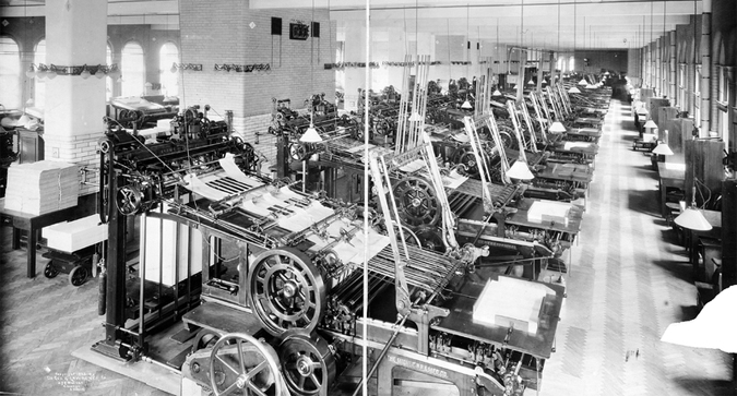
The Miehle P.P. & Mfg. Co. 1905 printing press. Credit: Public Domain / Wikipedia.
|
I'd like to sneak up on the question of 3-D printing by way of boring old 2-D printing.
Typography used to be heavy industry. The companies that make typefaces are still called foundries because there was a time when letters were made of metal. When you got enough of them together to reliably set a whole book or whatever, you had a serious amount of hardware on your hands. Fonts were forged. Picking a new one was a large capital investment. Today, fonts are a thing that you pick from a drop-down menu and printers are things in your home that can render just about any typeface you can imagine.
We went from massive metal fonts and centralized presses to the current desktop regime by degrees. In the early days of desktop printing, we had the dot-matrix. The deal was simple: "We give you one crappy font and you need specialized paper but you can do this at home". It wasn’t useful for much, but it was useful for some things, and used frequently enough that it was worth developing improvements.
Today, it's reasonable for most people to have a pile of paper and a printer that cost them next to nothing and for businesses to have stockrooms laden with the raw material of documents. Print shops have had to stay a step ahead, selling convenience, their ability to print nicer things on bigger formats, or the economics of scale.
I want you to bear this in mind, when you consider Chris Mims' argument that the idea that 3-D printing will be a mature technology "on any reasonable time scale" is absurd.
Chris is right that 3-D printing as it stands isn't a replacement for the contemporary industrial supply chain. It's clearly a transitional technology. The materials suck. The resolution is terrible. The objects are fragile. You can't recycle the stuff.
Maybe early home 3-D printers use only plastic and can only make objects that fall within certain performance restrictions. Maybe it starts out as, like, jewelry, the latest model toys, and parts for Jay Leno's car. But there's no way that lasts. People are already working on the problem. They are working especially hard on the materials problem.
At the same time, it's not hard to imagine a convergence from the other direction. Some materials and formats will fall out of favor because they are hard to make rapidly. Think of how most documents are 8.5×11 (or A4) these days. It's just not worth the hassle of wrangling dozens of paper formats.
It's also important not to confuse 3-D printing & desktop-class fabrication. These aren't the same thing. There is more to desktop manufacturing than 3-D printers. A well-appointed contemporary maker workshop has working CNC mills, lathes, and laser cutters. A well-appointed design studio has the tools to make and finish prototypes that look very nice indeed. Aside from the 3-D printer, none of these tools are terribly science-fictional; they're well-established technologies that happen to be getting cheaper from year to year.
Something interesting happens when the cost of tooling-up falls. There comes a point where your production runs are small enough that the economies of scale that justify container ships from China stop working. There comes a point where making new things isn't a capital investment but simply a marginal one. Fab shops are already popping up, just like print shops did.
Copyright Technology Review 2012.
Tuesday, May 24. 2011
Via Creative Review
-----
by Gavin Lucas
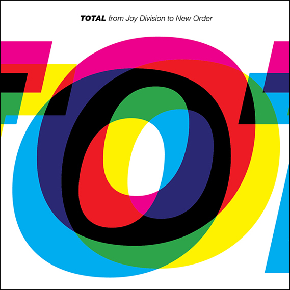
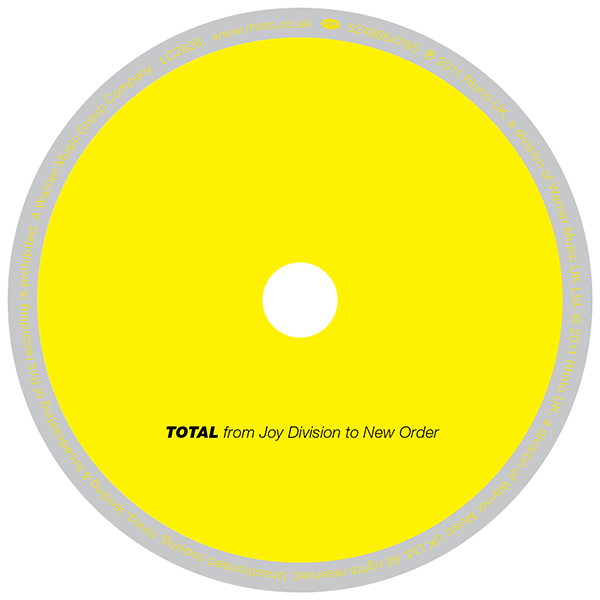
Peter Saville and and Howard Wakefield of design studio ParrisWakefield have collaborated on the artwork of a new compilation of music by Joy Division and New Order called TOTAL, due for release on June 6 from Rhino...
Endeavouring to capture the essence of both Joy Division and New Order, Saville and Wakefield agreed that the Helvetica Heavy Italic used on the cover of New Order's Technique album, perfectly conveyed the band's graphic look, and also that, typographically speaking, Joy Division was predominantly uppercase. So for the cover of this new compilation, the pair decided to merge the two and set the word TOTAL in italicised upper case Helvetica Heavy.
Originally the word TOTAL, as below, was set to appear as large as possible so it fitted on the front cover. However the band decided there was too much white space.
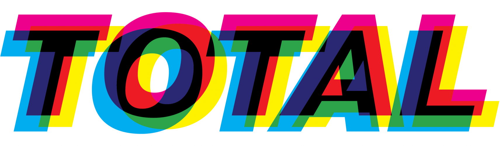
"The 'O' was the sexiest letter," says Wakefield, "with the overlapping letter-forms alluding to the sleeve of New Order's Technique album and also to the band's 1989 single, Run 2. Funnily enough 'O' is also the only letter to appear in New Order, Joy Division and TOTAL." Wakefield decided to zoom in the 'O' and let the other letters wrap around the fold out CD insert. The letters also appear to wrap around from the back cover and the jewel case spine too:
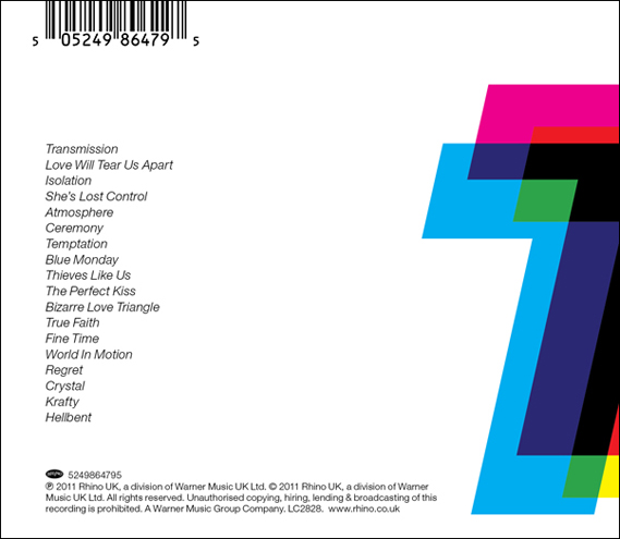
Art direction: Peter Saville. Design: Howard Wakefield. TOTAL will be released on June 6. See rhino.co.uk
Personal comment:
Because I'm a fan... of Saville, Joy Division and New Order! Makes a lot of reasons to blog it (even if I agree, not the best JD cover)!
Wednesday, March 30. 2011
Via Creative Review
-----
By Patrick Burgoyne
 www.creativereview.co.uk/cr-blog/2011/march/wim-crouwel-at-londons-design-museum www.creativereview.co.uk/cr-blog/2011/march/wim-crouwel-at-londons-design-museum
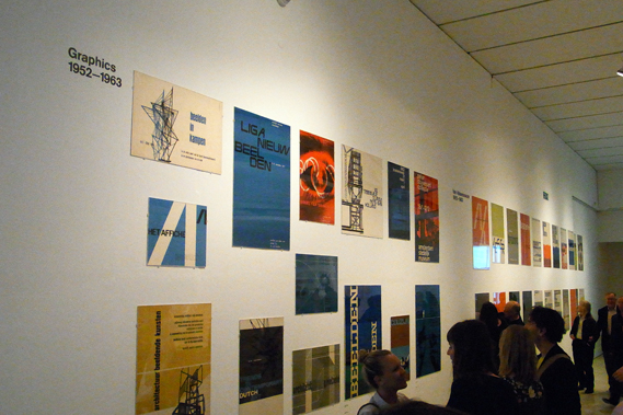
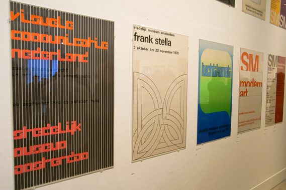
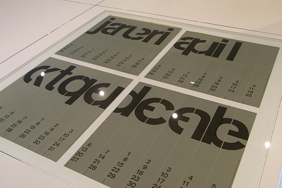
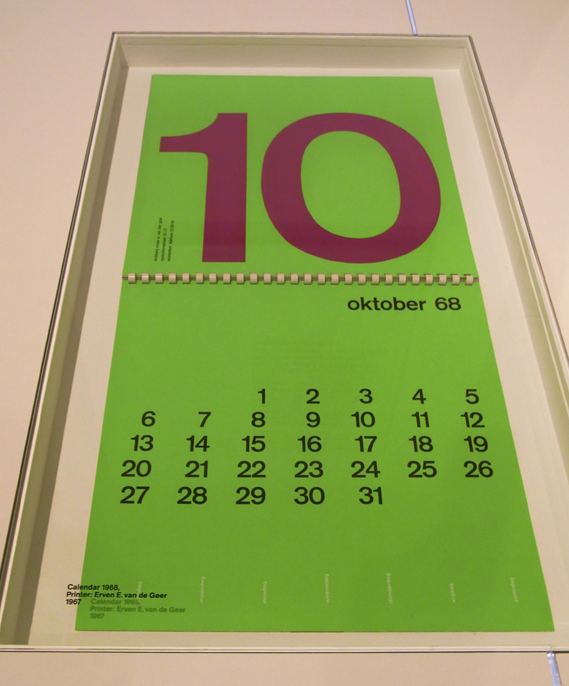
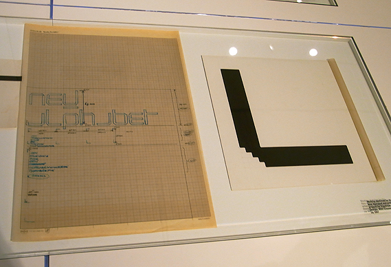
The Design Museum's Wim Crouwel show opened last night and... it's fantastic. A substantial, 'proper' graphic design exhibition given the space and treatment that Crouwel's extraordinary output deserves
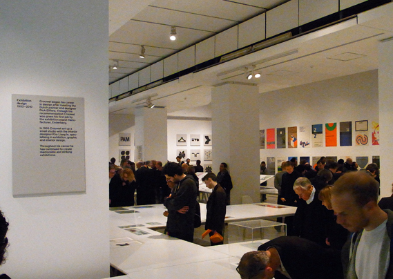
The Design Museum often seems nervous about graphics – perhaps it is unconvinced that graphic design can attract the visitor numbers and sponsorship that fashion or furniture can command. Wim Crouwel A Graphic Odyssey takes the first floor room that also housed the Peter Saville and Alan Fletcher shows. But the space has been transformed.
Much credit must go to the show's designers, architects 6a who, along with co-curator Tony Brook, persuaded the Design Museum to open up the space and paint it white. At previous shows in that room, the space has been divided, with visitors taken round a pathway into individual spaces. The Crouwel show is in one big room and all the better for it.
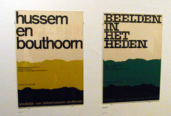
The serried ranks of Crouwel's posters also look fantastic from a distance, as do run-outs of some of his many logos.
Printed material is housed in a series of simple white tables, one set being raised to afford a better view.
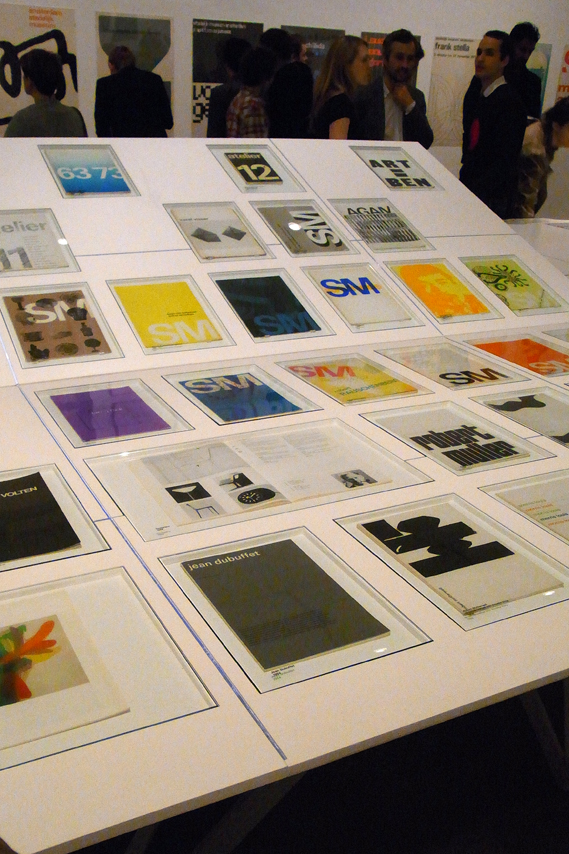
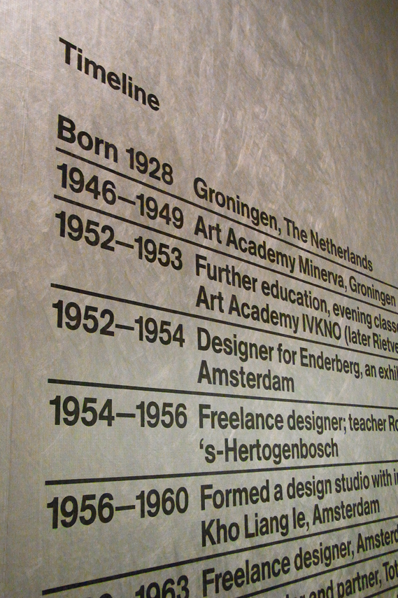
The whole thing is very simple, very clean and ordered. Sometimes graphic design shows can seem too ephemeral, trivial almost. Wim Crouwel A Graphic Odyssey is a serious, substantial retrospective of a phenomenal career and a fitting tribute to a truly great designer. Co-curators Brook and Margaret Cubbage should be congratulated on what is, for my money, the finest graphic design show that the Design Museum has staged. Let's hope it opens the door for more in the future.
NB: We thought you'd appreciate these images as a first sight, but the show is to be professionally photographed in the next few days. We will update with better images when we can get them. Michael Johnson has also blogged about the show here
Wim Crouwel A Graphic Odyssey is at the Design Museum, Shad Thames, London SE1 until July 3.
RELATED CONTENT
Rick Poynor discusses the extraordinarily high regard in which Crouwel is held by some UK designers here
Fancy some Wim Crouwel wallpaper?
How Blanka lovingly recreated Crouwel's classic Vormgevers poster, complete with wobbly hand-drawn lines, here
A review of Crouwel's 2007 D&AD President's Lecture
Michael C Place and Nicky Place of Build interview Crouwel for CR, here
Thursday, March 03. 2011
Via Creative Applications
-----
by Filip

Created by Naoki Nishimura, Helvetica Face is a Livetype format font. This new Helvetica family font changes the “typeface” based on the posting of a new “face”. The site allows you to record your face within the font, adjusting the threshold resulting in a new glyph you can download.
While normal fonts which are governed by software rules on how to show the internal form (=data), Helvetica Face doesn’t have this internal information on the form. What is does have is external data given in the shape of a image of your face, and how to show that form is the only rule. For that reason, through the given data, the form continues to change without bounds.
Livetype is a new font format which takes a variety of data and can change the form of it in real time.
livetype.in/face/
  
Thursday, February 17. 2011
Personal comment:
The resurgence of the old, useless and overwhelming "pop-up" style (even though this consists in windows opening) that we somehow miss since Jodi went "quiet"!
Friday, November 12. 2010
Via It's Nice That
-----
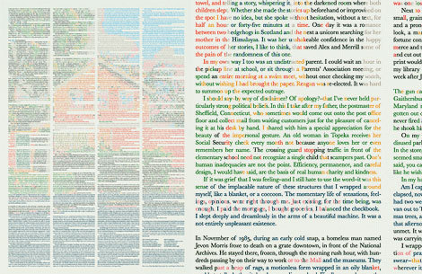
I have been utterly seduced by this piece from Stockholm’s Klaus Ernflo. I (like you) am still kicking myself for not thinking of it first, such a simple idea incredibly well executed – a story with its words coloured to create an image about that piece of writing. How nice would a whole series of these be?
Monday, October 11. 2010
Via GOOD via Information aesthetics
-----
by Patrick James
Wednesday, July 21. 2010
Via It's Nice That
-----
by Alex
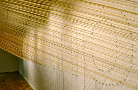
Aaron Rayburn and a band of seventeen other Portland-based creatives set themselves the task of creating a collaborative project as a single unit, and the results are magnificent. Their outcome, on display at the Littman Gallery is a giant piece of type using 14.2 miles of string, outlining 25 letters on 2,500 eyelets, strung by hand. Aaron explained things a little more, and also sent us through some more pics… (Read more)
Flickr Link
Tuesday, March 23. 2010
Via Mashable
-----
 The Department of Architecture and Design at New York’s famous Museum of Modern Art has acquired what is arguably its most famous work of art to date — the @ symbol. The Department of Architecture and Design at New York’s famous Museum of Modern Art has acquired what is arguably its most famous work of art to date — the @ symbol.
Because the @ symbol is owned by no one, the acquisition is symbolic — pun hopefully not intended — but @ will nevertheless be placed on display. The museum will exhibit renderings of @ in several typefaces, and will label them as it might label works made from or on differing materials.
The decision was made in response to the symbol’s radical rise in prominence in the age of the Internet. @ is actually hundreds of years old, but until the late 20th century, it was an arcane device used in shipping manifests and accounting books. It evolved to another plane in the zeitgeist when American engineer Ray Tomlinson was looking for a way to concisely reference users’ locations within a network while working on ARPANet.
Tomlinson observed that the @ symbol was placed on keyboards because of its use in accounting, but that it was rarely if ever used outside of that limited scope. Thus, it was up for grabs as far as he was concerned. Now when we send an e-mail, we send it to a person @ a domain — his or her digital dwelling. @ has become one of the world’s most ubiquitous and unifying symbols, connecting people across every cultural border.
It continues to evolve even now, as its usage on Twitter, Facebook and other services has made it a sign of identity. I am not samuelaxon on Twitter; I am @samuelaxon on Twitter. The development of this new meaning was almost an accident, but that usage has already become common.
MoMA Senior Curator Paola Antonelli wrote of the symbol, “It might be the only truly free — albeit not the only priceless — object in our collection.” Free but priceless — like the @ symbol and its many meanings, that concept is increasingly a familiar one for today’s Internet-connected civilization.
[via The New York Times]
|