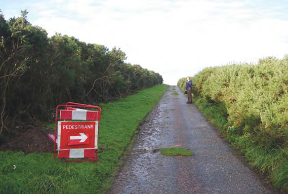
A nice walk, spoiled (by utterly pointless signage). Image by Kate Gordon Roger, Morayshire
The Manifesto Club is an organisation that campaigns against the hyperregulation of everyday life and the increased threat to public freedoms. Their new book, Attention Please, is a collection of photographs that document the use of prescriptive safety signage that, far from alerting people to imminent danger, merely highlights the absurd policing of ordinary people doing ordinary things...
This printed version of the original Attention Please online gallery (that began in 2007) includes a selection of pictures of "pseudo-safety signage", as the Manifesto Club's Josie Appleton writes in her introduction.
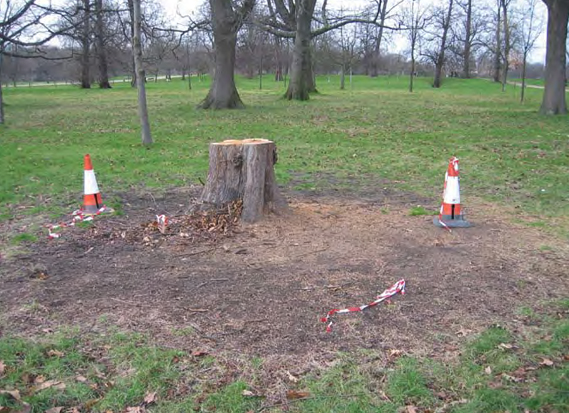
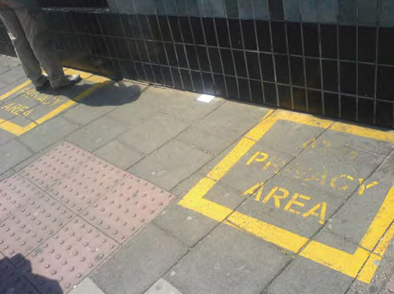
The book, designed by St Pierre & Miquelon, features images of cones surrounding innocuous tree stumps, yellow 'privacy zones' outside cashpoints, and the countless site-specific warning signs that can really, really annoy (not to mention impinge upon a nice view).
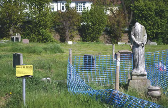
Take the following picture of some presumably long-aged gravetones in a cemetery in Tooting, London, for example:

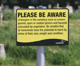
Not content with erecting a tasteful blue plastic fence around a (admittedly headless) statue, Lambeth council alert all passing visitors – not to mention mourners – that some of the traditionally static blocks of marble and sandstone may, in fact, cause harm:

Images by Timandra Harkness, Tooting, London
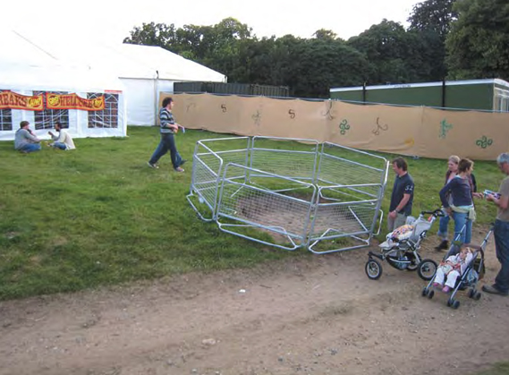
Check out exactly what's being cornered-off in these examples of some decidedly over-zealous fencing:

Image by Simon Elvins, Latitude Festival, Suffolk
A patch of bare earth. But it is on a slight incline. Careful now.

Image by Simon Elvins, Lisbon

Image by Dan Shadbolt, Highgate, London
Amusing as these images and most of the ones in the book are; the Manifesto Club's point is far from a joke.
They believe that the hundreds of instances where signage no longer signifies a significant risk are, in themselves, detrimental to public life, particulary to our enjoyment of public space.

Image by Ryan Ras, Hyde Park, London
Walk down any high street (and this is in no way unique to the UK) and the proliferation of ugly, unnecessary and patronising safety signs is overwhelming.
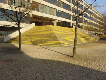
You don't have to look hard for example either – the stripey tape, the orange cones and lines of yellow paint can make an appearance in the most innocuous of places.
Can you spot the steps in this picture of the entrance to a Leeds University building? (Clue: they're just behind the trees).

Image by Mark Harrop, Leeds University

Safe banking, thanks to an ATM PRIVACY AREA. Image by Josie Appleton, Brighton
But, worryingly, as Appleton states in her introduction, what's happening more and more is that "caution [is being] integrated into design itself."
Next time you're on a new Virgin train, check the carriage doors from the inside. Each one has multiple day-glo stripes and built-in warning lights. Safety first, or just excessive?
In this case, far from being council busy bodies who need to rein in their use of signage, it's designers who have the opportunity to stop the spread of this virulent visual disease.

Image by Matthew Barnes, Southwark, London
This one, however, can stay.
Attention Please is published and distributed by Manifesto Club and is available to buy, here, for £12 (plus p&p). The book is edited and designed by Josie Appleton and the design group, St Pierre & Miquelon.
-----
Via Creative Review

