Sticky Postings
By fabric | ch
-----
As we continue to lack a decent search engine on this blog and as we don't use a "tag cloud" ... This post could help navigate through the updated content on | rblg (as of 09.2023), via all its tags!
FIND BELOW ALL THE TAGS THAT CAN BE USED TO NAVIGATE IN THE CONTENTS OF | RBLG BLOG:
(to be seen just below if you're navigating on the blog's html pages or here for rss readers)
--
Note that we had to hit the "pause" button on our reblogging activities a while ago (mainly because we ran out of time, but also because we received complaints from a major image stock company about some images that were displayed on | rblg, an activity that we felt was still "fair use" - we've never made any money or advertised on this site).
Nevertheless, we continue to publish from time to time information on the activities of fabric | ch, or content directly related to its work (documentation).
Thursday, July 04. 2013
Via Creative Applications
-----
By Filip Visnjic

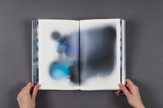
Eyes on the Sky is a process-based investigation into generative design and the weather linking 64 public-access web cameras across Europe, recording the colour of the sky and producing a book that collects a week of paintings where cameras paint the weather. 
Tuesday, February 21. 2012
Via Booketing
-----
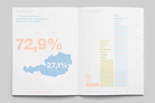
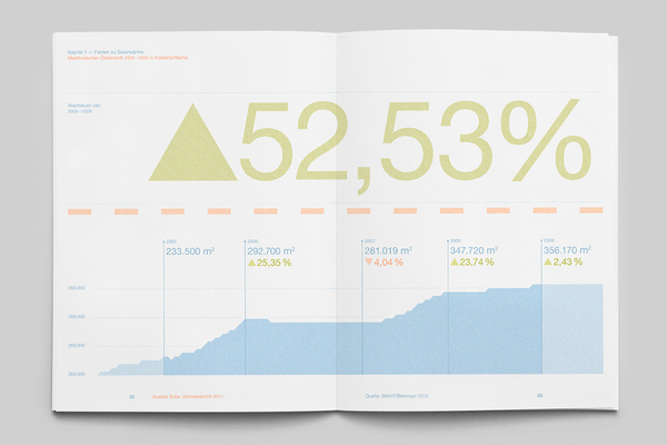
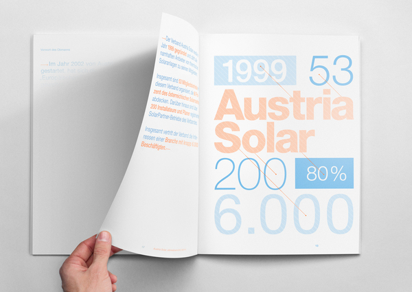
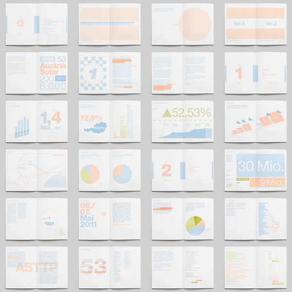
L’association Austria Solar (regroupant des entreprises du secteur photovoltaïque), a demandé à l’agence Allemande, Service Plan de s’occuper de la création de leur rapport annuel. Ce sont les graphistes Matthäus Frost et Mathias Nösel qui ont travaillé sur ce projet pour le moins originale. Ils ont utilisé une encre spéciale qui permet l’apparition du contenu lorsque les pages réagissent avec les rayons du soleil. Plutôt astucieux ! Là où c’est fort, c’est que même dans une pièce éclairée, il ne se passe rien, c’est vraiment uniquement grâce à la lumière naturelle que le contenu se révèle.
Vous remarquerez donc une mise en page épurée, avec des infographies en trois couleurs. Afin de mieux vous rendre compte du résultat, vous pourrez découvrir à la suite, photos et vidéo. N’oublions pas de mentionner également le bon boulot de l’imprimeur, Mory & Meier.


Et pour finir, la vidéo qui montre la « transformation » en direct :
Personal comment:
Is this a basic phosphorescent ink (like there are also thermal inks that reacts to special temperatures) or a special one that seems to react only to the sun's light wavelength? In any case, it would be interesting to have colors/texts/patterns that appears only under very specific conditions (a very precise wavelength or temperature or when some particles are detected in the air). A low-fi "media facade" so to say.
Friday, November 18. 2011
Via @chrstphggnrd
-----
A curious project and fake old book about the future that Christophe Guignard pointed out to me. Designed as an exhibition project by designer/photographer Cameron Baxter.

Tuesday, November 01. 2011
Via Creative Review
-----
de Patrick Burgoyne
Walter Isaacson's biography of Steve Jobs is full of examples of the latter's 'challenging' behaviour. But when Jobs asked Paul Rand to create the identity for his Next business, he finally met his match
Isaacson's book describes how Jobs, in 1986 and recently ousted from Apple, wanted a logo for his new computer business, Next. He decided to go for the best – Paul Rand. But Rand was contracted to IBM at the time. After pestering IBM senior management, Jobs managed to get their permission to use Rand and flew him out to California.
The Next was to be cube-shaped so Rand suggested the logo be so too. Jobs agreed and asked to see some options. Big mistake. Rand didn't do options.
"I will solve your problem and you will pay me," he told Jobs. "You can use what I produce or not, but I will not do options, and either way you will pay me." And it would cost $100,000.

Two weeks later, Rand flew back and presented his solution in the form of a book (scan above, more at Imprint here) walking Jobs through the rationale. Jobs loved it but asked for the yellow of the 'e' to be brighter. According to Isaacson, "Rand banged his fist and declared, 'I've been doing this for fifty years and I know what I'm doing.' Jobs relented."
Not only that, but he respected Rand for standing up to him, as this interview shows (spotted over at David Airey's LogoDesignLove site). A lesson there for anyone presenting to clients? Perhaps, but Rand was 71 at the time and a globally-renowned expert in his field: not everyone could get away with it.
Monday, July 18. 2011

Printed Book + Physical Hyperlinks = Real Page-Turner by Delana in Architecture & Design.
Try to describe a recent dream to someone and the details are likely to dissolve into absolute nonsense. Dreams themselves are ephemeral, fleeting and altogether mysterious. But trying to figure out the connections between different events in the dream and certain components of reality can prove even more confusing than the dreams themselves. This incredible project perfectly embodies the beautiful confusion that is the dreaming mind.

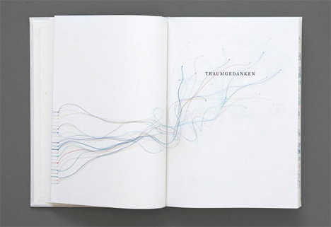
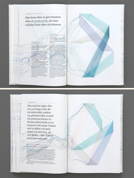
Designer Maria Fischer produced the book Dream Thoughts as her diploma project at the University of Augsburg, Germany. The book is a tangible model of the most intangible subject: dreams. Scientific, literary and philosophical texts about dreams are arranged on the pages to give a conceptual understanding of the many different aspects of dreaming.

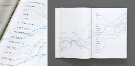
But like a dream, nothing in this book is quite that simple. Various terms and concepts are “hyperlinked” within the book. Like internet hyperlinks, these physical links lead to related information. But of course, these links are not established with computer code; they are made with thin pieces of thread.

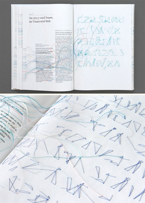
The threads wind their way through the pages, across plains of paper and from one word to its distant partner. Their various colors paint a type of abstract picture with no particular form and no particular meaning other than that of unifying various parts of this unusual text. The winding, flowing forms of the threads offset the more concrete, stable words on the page to create a visual representation of the various parts of the stories our minds create while we sleep.

One page in the book contains a hidden message, spelled out in thread and visible only from the back side. The actual message is hidden within a folded page. Only the negative spaces of thread can be seen from the back, making the message impossible to read. The unreadable message embodies almost everything we know about dream interpretation: there is a message there, to be sure, but it lies obscured behind a curtain of interpretation and foggy memory.
Tuesday, May 24. 2011
Via Creative Review
-----
by Gavin Lucas

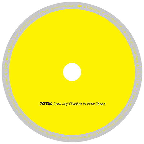
Peter Saville and and Howard Wakefield of design studio ParrisWakefield have collaborated on the artwork of a new compilation of music by Joy Division and New Order called TOTAL, due for release on June 6 from Rhino...
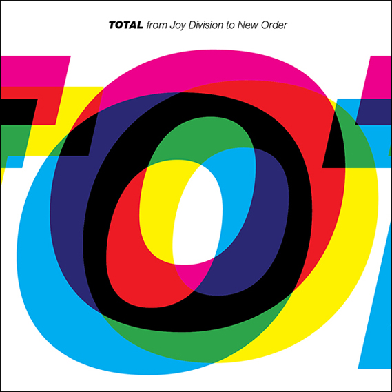
Endeavouring to capture the essence of both Joy Division and New Order, Saville and Wakefield agreed that the Helvetica Heavy Italic used on the cover of New Order's Technique album, perfectly conveyed the band's graphic look, and also that, typographically speaking, Joy Division was predominantly uppercase. So for the cover of this new compilation, the pair decided to merge the two and set the word TOTAL in italicised upper case Helvetica Heavy.
Originally the word TOTAL, as below, was set to appear as large as possible so it fitted on the front cover. However the band decided there was too much white space.

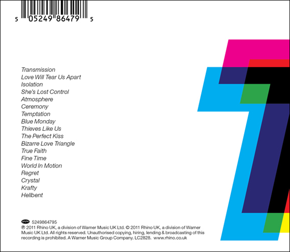
"The 'O' was the sexiest letter," says Wakefield, "with the overlapping letter-forms alluding to the sleeve of New Order's Technique album and also to the band's 1989 single, Run 2. Funnily enough 'O' is also the only letter to appear in New Order, Joy Division and TOTAL." Wakefield decided to zoom in the 'O' and let the other letters wrap around the fold out CD insert. The letters also appear to wrap around from the back cover and the jewel case spine too:


Art direction: Peter Saville. Design: Howard Wakefield. TOTAL will be released on June 6. See rhino.co.uk
Personal comment:
Because I'm a fan... of Saville, Joy Division and New Order! Makes a lot of reasons to blog it (even if I agree, not the best JD cover)!
Wednesday, March 30. 2011
Via Creative Review
-----
By Patrick Burgoyne
 www.creativereview.co.uk/cr-blog/2011/march/wim-crouwel-at-londons-design-museum www.creativereview.co.uk/cr-blog/2011/march/wim-crouwel-at-londons-design-museum
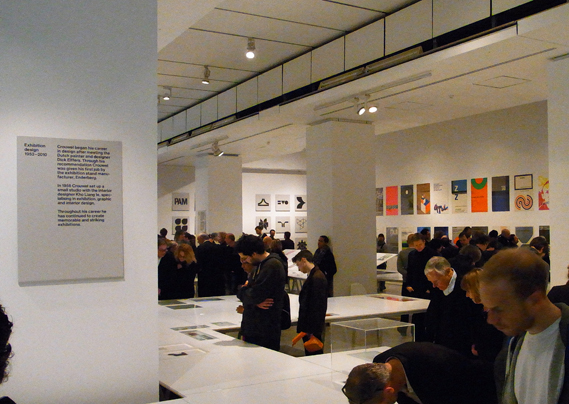
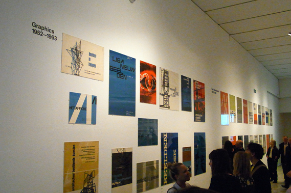
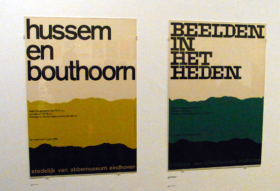
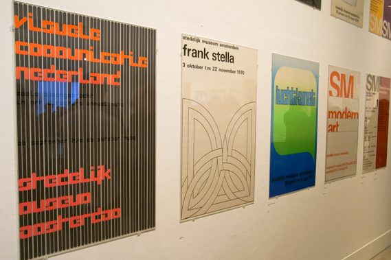
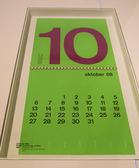
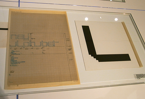
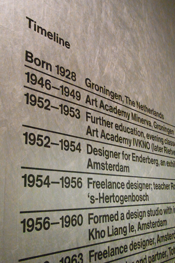
The Design Museum's Wim Crouwel show opened last night and... it's fantastic. A substantial, 'proper' graphic design exhibition given the space and treatment that Crouwel's extraordinary output deserves

The Design Museum often seems nervous about graphics – perhaps it is unconvinced that graphic design can attract the visitor numbers and sponsorship that fashion or furniture can command. Wim Crouwel A Graphic Odyssey takes the first floor room that also housed the Peter Saville and Alan Fletcher shows. But the space has been transformed.

Much credit must go to the show's designers, architects 6a who, along with co-curator Tony Brook, persuaded the Design Museum to open up the space and paint it white. At previous shows in that room, the space has been divided, with visitors taken round a pathway into individual spaces. The Crouwel show is in one big room and all the better for it.

The serried ranks of Crouwel's posters also look fantastic from a distance, as do run-outs of some of his many logos.

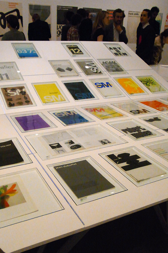
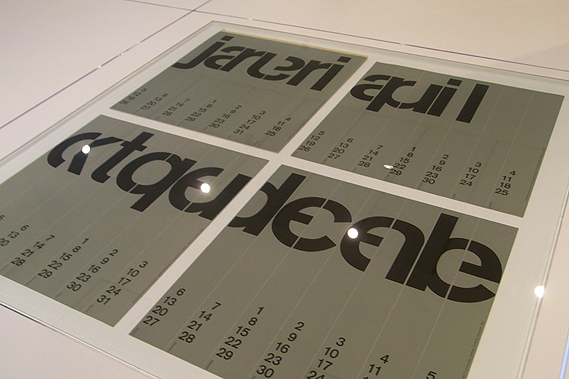
Printed material is housed in a series of simple white tables, one set being raised to afford a better view.


The whole thing is very simple, very clean and ordered. Sometimes graphic design shows can seem too ephemeral, trivial almost. Wim Crouwel A Graphic Odyssey is a serious, substantial retrospective of a phenomenal career and a fitting tribute to a truly great designer. Co-curators Brook and Margaret Cubbage should be congratulated on what is, for my money, the finest graphic design show that the Design Museum has staged. Let's hope it opens the door for more in the future.
NB: We thought you'd appreciate these images as a first sight, but the show is to be professionally photographed in the next few days. We will update with better images when we can get them. Michael Johnson has also blogged about the show here
Wim Crouwel A Graphic Odyssey is at the Design Museum, Shad Thames, London SE1 until July 3.
RELATED CONTENT
Rick Poynor discusses the extraordinarily high regard in which Crouwel is held by some UK designers here
Fancy some Wim Crouwel wallpaper?
How Blanka lovingly recreated Crouwel's classic Vormgevers poster, complete with wobbly hand-drawn lines, here
A review of Crouwel's 2007 D&AD President's Lecture
Michael C Place and Nicky Place of Build interview Crouwel for CR, here
Tuesday, March 08. 2011
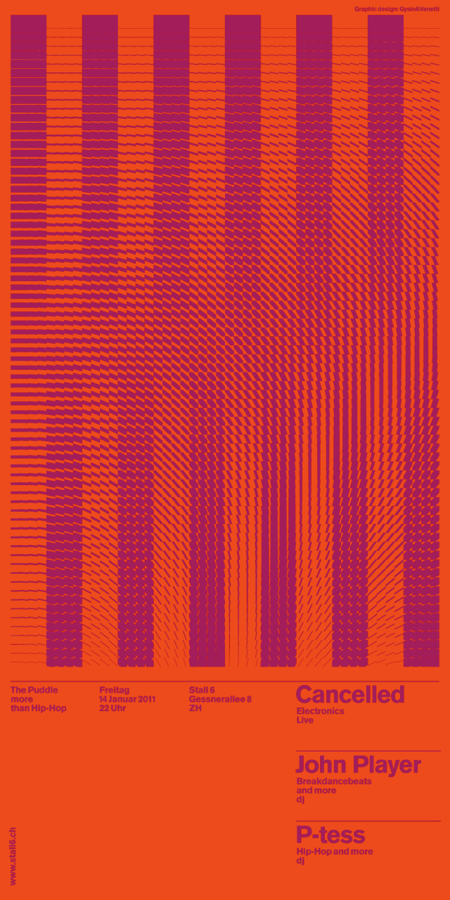
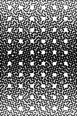
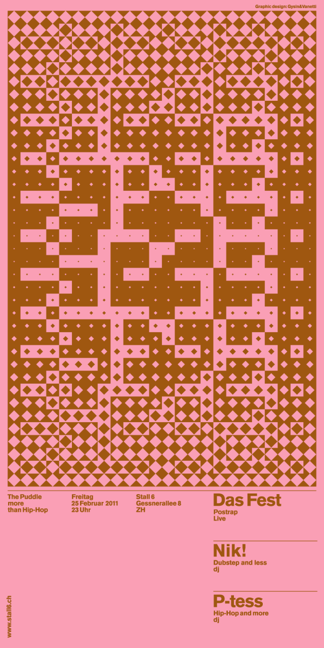
Used for the Posters and flyers for The Puddle (Stall 6), Andreas Gysin with Sidi Vanetti created this Processing for the production of the rasters, eventually screen printed on coloured paper.
Built with a modified version of Toxi’s cp5magic.
Try the applet version of the Puddle Builder 03 (PDF export is disabled).
Andreas Gysin. Born in Zürich. Design and code in Lugano, Switzerland. Occasionally teaching interaction at SUPSI, Lugano and ECAL, Lausanne. For projects and weirdness with pal Sidi Vanetti visit: www.gysin-vanetti.com
Previously: hms [iPhone] - a digital sculpture by Andreas Gysin


Thursday, March 03. 2011
Via Creative Applications
-----
by Filip

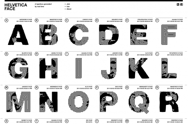
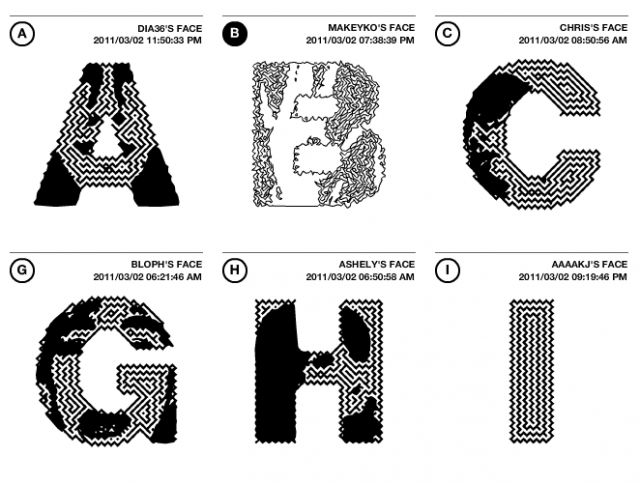
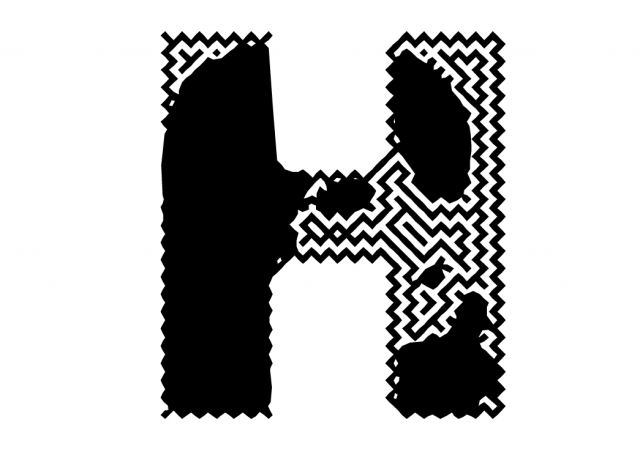
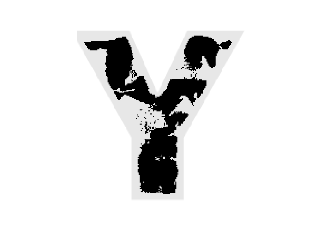
Created by Naoki Nishimura, Helvetica Face is a Livetype format font. This new Helvetica family font changes the “typeface” based on the posting of a new “face”. The site allows you to record your face within the font, adjusting the threshold resulting in a new glyph you can download.
While normal fonts which are governed by software rules on how to show the internal form (=data), Helvetica Face doesn’t have this internal information on the form. What is does have is external data given in the shape of a image of your face, and how to show that form is the only rule. For that reason, through the given data, the form continues to change without bounds.
Livetype is a new font format which takes a variety of data and can change the form of it in real time.
livetype.in/face/
  
|
