Tuesday, August 18. 2009
Personas: Representing Your Online Identity as Visual Data Portraits
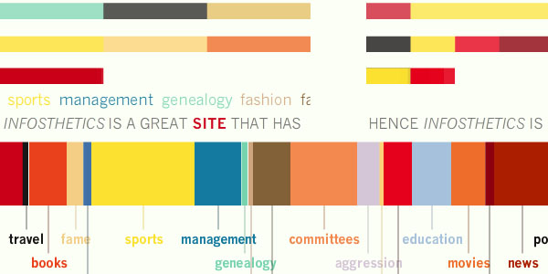
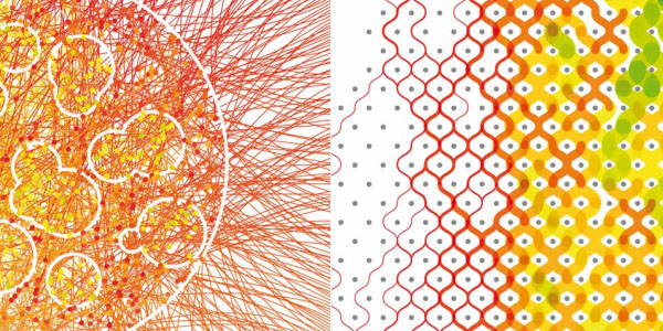
Personas [media.mit.edu] uses sophisticated natural language processing algorithms to create a detailed, visual data portrait of one's aggregated online identity.
Personas explores the web for information and attempts to characterize the person: to fit them to a predetermined set of categories that an algorithmic process created from a massive corpus of data. The computational process is visualized as a DNA-like, colorful strip with each stage of the analysis, finally resulting in the presentation of a seemingly authoritative personal profile.
Be sure to type in your own name in the online interface: is Personas able to analyze and represent your online identity in a sufficient way?
-----
Related Links:
Personal comment:
Pas très intéressant comme visualisation, mais le projet à l'air intéressant.
Friday, August 14. 2009
SIGGRAPH '09: Growth Rendering Device
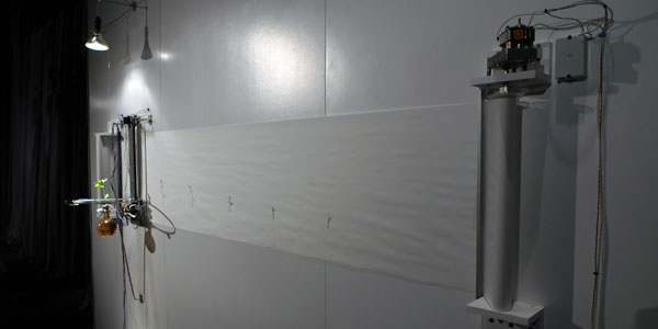
Growth rendering device [dwbowen.com] by David Bowen is a charming hybrid installation at display in the BioLogic Art Gallery at SIGGRAPH09. It consists of a pea plant fed by a hydroponic solution, a scanner and inkjet printer, joined into a self-documenting feedback system: the system documents the plant's growth - enabled by the system's nurture and light - by scanning it every 24 hours and printing the resulting outline on a paper roll right underneath the plant. The paper roll is then scrolled four inches to make space for the next print. The result is a growing series of daily plant portraits, documenting the full lifecycle of the plant.
See also C02 Translator Robot.
This post was written by Moritz Stefaner, a researcher and freelance practitioner in the field of information aesthetics. Occasionally, he blogs at well-formed-data.net.
-----
SIGGRAPH'09: The Information Aesthetics Panel(s)

The SIGGRAPH 2009 conference this year is trying out a new exhibition theme in the form of the "information aesthetics showcase". In the interview with infosthetics posted a while ago, the showcase curator Victoria Szabo revealed how this came about: the conference jury saw a lot of amazing information-driven work that did not fit the specific theme of the show, or demonstrate any one sufficiently new technical element to make it fit something like the Emerging Technologies venue either, although the works were worthwhile to be seen at the conference. Hence, the information aesthetics showcase was born, as "a place to show that fascinating work that talked back to the data, engaged it, transformed your understanding".
The new theme consists of 2 panel sessions, an art exhibition (description coming soon) and the keynote talk by Steven Nuebes.
Unfortunately, I missed the morning panel. Monday morning 8.30am proved to be to early for recuperating from a +20 hours flight and a -15 hours jet lag, registering on site and finding the correct location. However, the panelists lineup was impressive: Moritz Stefaner explained the Eigenfactor project, Norah Zuniga Shaw and Maria Palazzi showed Synchronous Objects, and Evan Tice presented Greenlite Dartmouth. Feedback from people who actually attended seemed to be unanimously positive, with a general consensus, from people independent from each other, that the Synchronous Objects project, which was the product of an elaborate three year long collaboration with choreographer William Forsythe, showed an unexpected depth and richness that it definitely requires a revisit for any information aesthetics fan. Moritz Stefaner shared his design process, including sketches of paths not taken and very intriguing "outtakes" resulting from coding errors. Unfortunately, Lorie Loeb, director of the Greenlite Dartmouth project, was not able to be there. Her collaborator, recent graduate Evan Tice, explained how the emotional resonance of the plight of a polar bear, can influence people's awareness of their use of energy.
The afternoon panel had some issues of its own. A continuous bad audio feed made some audience members cringe and even leave. The panel members' presentations (of which I myself was part) did barely touch each other, and might have made the topic seem overly broad and complex.
Michael Kelly, aesthetics expert and professor of Philosophy at the University of North Carolina at Charlotte, described the issues involved in interpreting aesthetics in several relevant fields. He defined aesthetics as the "critical thinking about the norms (standards) of our cognitive and affective experiences in art, culture and nature" but also "in the interactivity that connects humans and computers", which always more apt than talking about just beauty and subjectivity. The use of sensible aesthetics in data visualization is required as data is non-sensuous in 2 ways: data processing can remain inaccessible to our senses (e.g. invisible) and data needs not generate or have any sensuous forms (besides code). Secondly, to be experienced or to generate experiences, and become intelligible, data has to take on some sort of sensuous form. This is the true challenge for visualization: finding the most suitable and enjoyable metaphor for essential non-visual insights.
Victoria Vesna explained the process behind her latest project The Katrina Project: NO-LA. NO-LA involves collaborators from art, design, behavioral science, journalism, and community outreach. A database-driven, activist web site explores the psychological and social effects of the storm and its aftermath through interviews with, and works by various artists in New Orleans and Los Angeles. It is also based on material and information about the Katrina disaster retrieved by undergraduate students, which was then designed into infographical posters. The website aims to become a database of works by moviemakers, photographers, and others in the creative community that work around the topic of Katrina.
Paul Fishwick, editor of the book Aesthetic Computing, discussed this very topic from the viewpoint of teaching a creative computer science course. Computing, seen as mathematical structures such as data and structure (e.g. sequence, branching, iteration, encapsulation), can be seen as possessing aesthetic qualities. Here, aesthetic is more about input/output and about structure, as software can have a wide audience. Software is as much about experience and interaction as about analysis and performance.
The fourth speaker was yours truly, showing the wide spectrum of information aesthetic works, a model that suggest 3 criteria for information aesthetics, and potential useful usages for data visualization applications in the future.
The last speaker, Kenneth Huff, showed his intriguing works of computational art, of which the image above is only a small example. In search of truly random data without repetition, he discovered the beauty of real data, here in the form of prime numbers. His works are not really data representations, but use abstract data as a sort of genetic material or raw material foundation for further algorithmic and visual treatment. Inspired by the random, yet structured beauty and minute details of nature (flora, fauna and mineral), multitudes of objects often are included in works, frequently similar in form, yet always unique in their details.
-----
Related Links:
Personal comment:
Une série de liens et de noms en relation avec l'"Information/data design". Dans le cadre d'une exposition lors de Siggraph 2009. Avec un projet développé par le chorégraphe William Forsythe (un des meilleurs chorégraphe contemporain, labellé toutefois "néo-classique").
Wednesday, July 15. 2009
Hellman's Eat Local, Eat Real Campaign: Food-Driven Infographic Movie
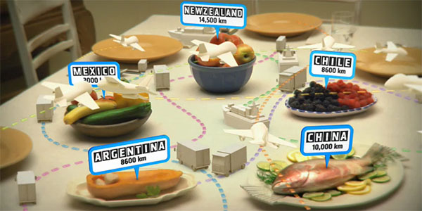
This is a must-see. The beautifully made infographic animated movie "It's Time for Real / Eat Local, Eat Real" highlights the increasing tendency of food importation, and how this phenomenon influences the economy, the environment and our neighborhoods. The message is mainly meant for Canadians, but certainly applies universally.
The movie, with a graphical style similar to the Stranger than Fiction opening scene, is part of the campaign Eat Real, Eat Local [eatrealeatlocal.ca], by the Unilever brand Hellman's. More information about the design process and creation of the movie can be found at the Glossy project page:
"We all found the statistics pretty eye opening. I think everyone involved changed the way we buy our food. Yoho's wife had a baby girl in the middle of the project, and I grew a playoff beard which I've been reluctant to shave (just superstitious I guess). Challenges early on were the levels of legal approval the team at Unilever and Ogilvy had to go through on all the stats. Everyone wanted to make sure that the information was fair and irrefutable. All the food in the shoot was Canadian, which is no small challenge in spring. I don't think I've ever been hugged by agency and their clients in twenty years in the business. That was definitely a high point."
You can watch the video HERE.
-----
Personal comment:
"Information design" (motion, 3d) en rapport avec le post ci-dessous bien sûr. Concerne le canada, mais a le mérite de donner de la visibilité aux chiffres.
Tuesday, June 23. 2009
Computer Clusters That Heat Houses
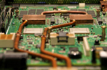 |
| Keeping cool: A novel on-chip water-cooling system developed by IBM could make it efficient for data centers to provide waste heat for buildings. Credit: IBM Zurich Research Laboratory |
Thanks to a novel on-chip water-cooling system developed by the company, the thermal energy from a cluster of computer processors can be efficiently recycled to provide hot water for an office, says Bruno Michel, manager of advanced thermal packaging at IBM's Zurich Research Laboratory, in Switzerland. The goal, he says, is to improve the energy efficiency of large computing clusters and reduce their environmental impact.
A pilot scheme involving a computer system fitted with the technology is expected to save up to 30 tons of carbon dioxide emissions per year--the equivalent of an 85 percent carbon footprint reduction. A novel network of microfluidic capillaries inside a heat sink is attached to the surface of each chip in the computer cluster, which allows water to be piped to within microns of the semiconductor material itself. Despite its close proximity to the circuitry, there is no danger of leakage, says Michel, because the capillaries are hermetically sealed. By having water flow so close to each chip, heat can be removed more efficiently. Water heated to 60 °C is then passed through a heat exchanger to provide heat that is delivered elsewhere.
IBM has spent several years developing the microfluidic cooling technology, and it plans to test it in partnership with Swiss Federal Institute of Technology, in Zurich. A 10-teraflop computer cluster consisting of two IBM BladeCenter Servers in a single rack will be used by the university's Computational Science and Engineering Lab to model fluid dynamics for nanotechnology research. The water will then be plumbed into the university's heating system, where it will help heat 60 buildings. "This is the first large-scale system," says Michel. "It's about one-twentieth of the size of an average data center." Ultimately, he says, the technology could help address the energy problems posed by large data centers.
Up to 50 percent of the energy consumed by a modern data center goes toward air cooling. Most of the heat is then wasted because it is just dumped into the atmosphere. There have been a few efforts to recycle the heat generated by conventional data centers. For example, a nine-story, 18,500-square-meter data center being built in London by the hosting company Telehouse Europe will provide heating for nearby offices. Other companies, including IBM, have used excess thermal energy to heat green houses or swimming pools. But reusing waste heat is expensive because usually only relatively low temperatures can be harvested, says Frank Brand, director of operations of the Dutch data-center engineering firm Imtech. "You can only get about 30 to 35 degrees Celsius," he says.
In contrast, because water is many times more efficient at capturing heat than air, water cooling can deliver much higher temperatures, says Michel. Water was once commonly used to cool mainframe computers, but this merely consisted of piping cold water through server cabinets to cool the air near the racks.
By some estimates, information technology infrastructure is responsible for as much as 2 percent of global carbon emissions, putting it on a par with aviation. And some experts say that this figure is set to double in the next five years.
"It's more efficient to heat water and move it somewhere else than it is with air," says Jonathan Koomey, a project scientist at Lawrence Berkeley National Laboratories and a consulting professor at Stanford University. In 2005, data centers were responsible for 1 percent of global electricity--a doubling of 2000 levels, Koomey says. But he's not convinced that the figure will continue to grow. "There are many ways to improve the efficiency of data centers," he says. For example, better management of computer centers can improve efficiencies dramatically. "We have servers that on average are running at 5 to 15 percent of their maximum load," Koomey says. "Even if the server is doing nothing, it's still using 60 to 70 percent of its power."
Brand also notes that "air is a much cheaper way to do the cooling" and that modern data centers consume far less energy than do their older counterparts for cooling.
The trend toward stacking processors on top of each other to increase their power density is another reason why IBM is pursuing this sort of microfluidic water cooling, says Michel. Such three-dimensional chips will pose serious problems for traditional air-based cooling systems, he says.
Copyright Technology Review 2009.
-----
Personal comment:
Voilà quelquechose qu'on attendait depuis longtemps et qui permettrait de développer un cycle énergétique-information au sein d'une architecture (ou d'un groupe architectural et une ferme informatique, etc.)
Tuesday, June 02. 2009
Random Walk: The Visualization of Randomness
-
Want to get a visual high today? The infographic masterpiece Random Walk [random-walk.com] ask the question "What does Randomness Look Like?" It attempts to give the answer(s) by showing the mysterious interactions of chaos and the order in randomness by simulating randomness in visualizations which are easy to understand.
The portfolio webpage contains a collection of zoomable illustrations, with detailed explanations plus summary captions in the yellow speech balloons on the right. Experimental visualized datasets include the constant number pi, the so-called Poisson distribution, the empirical results behind the normal distribution, the distribution of prime numbers, the first-digit law also called Benford's Law, the surface area calculation Monte Carlo Method, the Law of Large Numbers, an atom's or molecule's Brownian Motion, an atom's Half Life, the chaotic motion of a double pendulum, pseudo random number generation, and many more.
The project's author, Daniel A. Becker, adds this project to an already impressive portfolio, including the previously posted Barcode Plantage and the for-the-infosthetics-addict still unknown Visual DNA (discover!).
Based on these works, I think we certainly will see and hear more from him in the future. Do you agree?
Thnkx Daniel.
-----
Wednesday, May 27. 2009
Obama One People: Revealing the Emotional Flow of the Presidential Inauguration
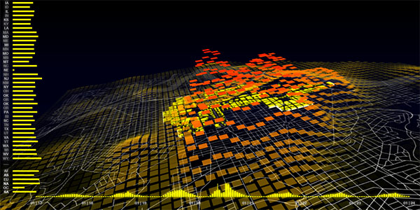
Obama | One People [senseable.mit.edu] consists of two "dazzling" visualizations that celebrate Barack Obama and the people who supported him from all over the U.S. and the world. The maps are based on mobile phone call activity that characterize the inaugural crowd and answer the questions: "Who was in Washington, D.C. for President Obama's Inauguration Day?" and "When did they arrive, where did they go, and how long did they stay?"
The data analyzed consists of hourly counts of mobile phone calls served in Washington, D.C. and includes the origin of the phones involved in the calls. The map of Washington, D.C. is overlaid with a 3D color-coded animated surface of square tiles (1 tile represents an area of 150 x 150 meters). Each tile rises and turns red as call activity increases and likewise drops and turns yellow as activity decreases. On the left, a bar chart breaks down the call activity by showing the normalized contributions of calls from the 50 states and 138 foreign countries grouped by continent. The timeline at the bottom illustrates the overall trend of call activity in the city during the week of the Presidential Inauguration.
"Examining the relative increase in call activity by state reveals some unexpected results. The states with the strongest increase were the southern states of Alabama, Georgia, Kentucky and Tennessee, with calls up to twelve times the normal levels. These are states that played a prominent role in the Civil Rights movement and notably are also so-called red states whose voting population went for the Republican candidate, John McCain. Other states with a ten-fold increase in call activity were Illinois, Barack Obama's home state, and Michigan, Ohio and Indiana, swing states which went blue, voting for President Obama. Most interestingly, comparing these results with U.S. demographic statistics shows that the percentage of African Americans in each U.S. state is a predominant factor determining increase in call activity and therefore participation in the event, which instead was not necessarily influenced by the state's proximity to Washington, D.C. or its political leaning." Other data analysis findings are described here.
Watch the three accompanying movies below.
See also World's Eyes: Mapping the Visual Traces of Tourism in Spain, Senseable City of New York, Real Time Rome and Mobile Phone Landscape Graz. Via datavisualization.ch.
-----
Personal comment:
Une cartographie "d'activité" de la ville (utilisation de téléphones portables lors du discours d'inauguration de B. Obama) qui révèle des "patterns" à priori invisibles. Ce type de visualisation de données extraites de la ville, développant de nouvelles cartes, une sorte d'"algorythmique du réel" (reality computation) va se développer de plus en plus, sur tout type de données.
Wednesday, May 20. 2009
Visualizing the Major Health Issues Facing Americans Today
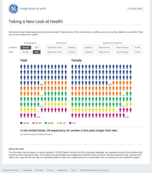
Ben Fry and Phyllotaxis recently released this impressive online visualization that shows the statistical connections between related medical conditions. The Health Visualizer [ge.com] focuses on the major health issues facing Americans today, by allowing users to compare demographics (i.e. gender, age), risk factors (i.e. body mass index, smoking), diseases and conditions (i.e. diabetes, hypertension, heart disease, stroke).
While the visual and the animations seem simple at first sight, the real strength lies in empowering users to explore the many (often causal) relationships between different sets of statistical data in an intuitive way.
-----
Related Links:
Personal comment:
Un site et une application (probablement réalisée avec Processing, du fait qu'il s'agisse du designer Ben Fry) en rapport avec des données sur la santé aux Etats-Unis (dont la cigarette). Le site est relativement simple mais l'application bien faite. Un graphisme d'information.
Thursday, May 07. 2009
KMLFactBook - A Data Visualization Tool with Google Earth
David Tryse continues to offer great methods for visualizing data with Google Earth. This time he has produced a great free tool called the KMLFactBook  . The KMLFactbook utilizes data available from the CIA World Factbook to let you pick and choose geographical-based data about the world and see 2D and 3D graphs of the data by country on either a 2D Google Map or use the 3D Google Earth plugin. You can also generate a KML file to view the data directly within Google Earth. There is a massive amount of data here to play with and get some interesting perspective about how things are going on our planet. Not only that, but the KMLFactbook provides details on how to upload your own datasets to generate other visualizations using simple spreadsheet formats.
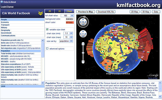
World Population Data
David had previously produced some visualizations for disappearing forests around the world, and the Edge of Existence collections in the Google Earth Outreach showcase. He also recommends the Thematic Mapping Engine by Björn Sandvik which uses similar techniques.
-----
Related Links:
Wednesday, April 22. 2009
Google Labs News Timeline
News Timeline [googlelabs.com] is a new Google Labs feature, which organizes news stories and other information by date. It allows users to view news and other data sources on a browsable, graphical timeline. The Google engineer who built it, Andy Hertzfeld, says he was inspired by Google Maps, but instead of letting people navigate through space, he wanted to let them navigate through time.
The depth and richness of the available datasets is impressive: news, magazines, blogs, TV shows, music, video games,... But also buildings, prizes, and artworks. For instance, blog posts can be shown on the timeline by selecting "Blogs" from the data source menu and typing the name of the blog in the query field.
As this news will distract you from your work anyway, you can also check out the recent Google Labs Similar Images page, which lets you refine image searches by visual similarity.
Via TechCrunch.
-----
Personal comment:
Browser les contenus à travers le temps (après y accèder à trvers l'espace --Google Maps--): l'empire de Google s'étend aux différentes dimensions...
fabric | rblg
This blog is the survey website of fabric | ch - studio for architecture, interaction and research.
We curate and reblog articles, researches, writings, exhibitions and projects that we notice and find interesting during our everyday practice and readings.
Most articles concern the intertwined fields of architecture, territory, art, interaction design, thinking and science. From time to time, we also publish documentation about our own work and research, immersed among these related resources and inspirations.
This website is used by fabric | ch as archive, references and resources. It is shared with all those interested in the same topics as we are, in the hope that they will also find valuable references and content in it.
Quicksearch
Categories
Calendar
|
|
May '24 | |||||
| Mon | Tue | Wed | Thu | Fri | Sat | Sun |
| 1 | 2 | 3 | 4 | 5 | ||
| 6 | 7 | 8 | 9 | 10 | 11 | 12 |
| 13 | 14 | 15 | 16 | 17 | 18 | 19 |
| 20 | 21 | 22 | 23 | 24 | 25 | 26 |
| 27 | 28 | 29 | 30 | 31 | ||
