Via ExtremTech
-----

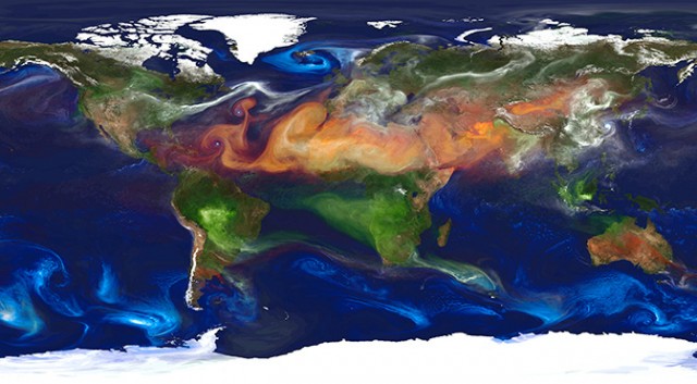
Here’s a mind-blowing view of the Earth that you’ve probably never seen — or even thought of — before. Dubbed “Portrait of Global Aerosols” by NASA, this is the kind of imagery that climate scientists use to analyze the Earth’s atmosphere, the weather, and trends such as global climate change.
Now, first things first: The Earth doesn’t actually look like this from space (alas). Rather, this is an image output by the Goddard Earth Observation System Model, version 5 (GEOS-5). GEOS-5 is an almighty piece of software that runs on a supercomputer at NASA’s Center for Climate Simulation in Maryland.
In the case of this image, GEOS-5 is modeling the presence of aerosols (solid or liquid particles suspended in gas) across the Earth’s atmosphere. Each of the colors represents a different aerosol: Red is dust (swept up from deserts, like the Sahara); Blue is sea salt, swirling inside cyclones; Green is smoke from forest fires; and white is sulfates, which bubble forth from volcanoes — and from burning fossil fuels. The full-size version of the image is particularly mesmerizing, with beautiful swirls of Saharan sand in the Atlantic, and perhaps the tail end of the Gulf Stream circling around Iceland.
It’s hard to be certain, but it seems like the US east coast, central Europe, and east Asia are burning a lot of fossil fuels. Japan, of course, sits on the edge of the Pacific Ring of Fire, so the sulfates there could be from volcanoes. The smoke in Australia is probably from forest fires — but the large volume of smoke from the Amazon rain forest and sub-Saharan Africa is curious. Are these forest fires, or the large-scale burning of wood for heat and power?

As you can imagine, the amount of raw data required to produce such imagery is immense. Weather modeling is still one of the primary uses of supercomputers. To create the Portrait of Global Aerosols, GEOS-5 will have aggregated the measurements from hundreds of weather stations across Earth, along with data from the four NASA/NOAA GOES weather satellites. So you have some idea of the complexity of the GEOS-5 model, the resolution of this image is 10 kilometers (6 miles) — meaning the Earth has been split into regions (“pixels”) of 10km2, and then the atmospheric conditions are simulated for each region. The surface area of the Earth is 510,072,000km2, which means the total number of regions is around 5 million.
Each of these 5 million pixels might have megabytes or gigabytes of weather data associated with it — and of course, in any given area, the weather in each pixel interacts with those around it. This gives you some idea of how much data needs to be processed and moved around — and it only becomes exponentially more complex as sensors improve (producing more data) and as you increase the depth of your analysis. In the case of climate change, for example, scientists are modeling decades or even centuries of data to try and divine some kind of pattern — a task that taxes even the most powerful supercomputers. If you’ve ever wondered why we keep building faster and faster supercomputers, now you know why.
Now read: What can you actually do with a supercomputer?


