Tuesday, October 28. 2008
Trendrr: Track, Compare & Share Data Online
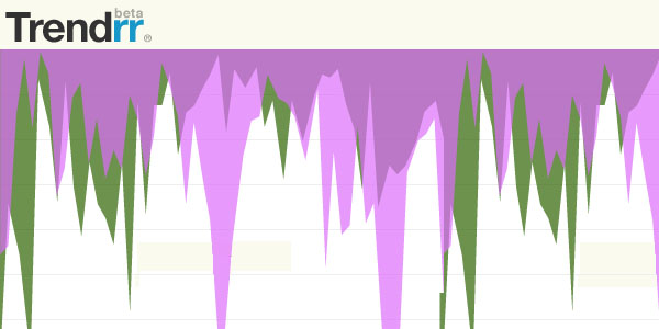
Yet another competitor of Many Eyes, Swivel, Track-n-Graph, WidGenie and the just-posted iCharts: Trendrr [trendrr.com] has the capability to track the popularity and awareness of trends across a variety of inputs, ranging from search engine results, news stories, social networks, to blog buzz and video views downloads. This means one is able to compare Amazon book ranks, with Google News results, with MySpace page views, with YouTube video views, and so on. Results include data mash-ups like the comparison of frequency of online news stories about "foreclosure" and "Britney Spears" or the number of blog posts mentioning Neal Stephenson's new book versus the Amazon Sales Rank.
In an interesting twist on user interaction, users can drag multiple graphs to a "scratch pad", where they can be overlayed or put side-by-side, and compared. The full screen feature reveals advanced options such as relative/absolute change, timeline zooming and user-configurable annotations. However, one needs to be a member to embed the graphs on 3rd party sources. From any graph page, one can click the 'about' tab to embed it.
First, I was convinced widgenie and Trendrr were somehow related, but it seems the similar web layout, and in particular the "track/compare/share" versus "plugin/create/share" is purely accidental. It is also a bit surprising how even with the seemingly rich amount of data inputs available, only a few interesting correlating graphs have been produced.
Via datamining.typepad.com. You might also be interested in mycrocosm and daytum.
Related Links:
Friday, October 10. 2008
Sony, Microsoft virtual communities to start
Uncanny valley variability
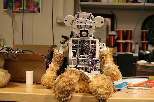
Which part of this bear encountered yesterday at MIT Medialab is close to the Uncanny Valley? The bear-head-shaped face? The way it looks down? the fur-like body parts? or the explosive body wiring? Is the furry part more uncanny than the head?
Related Links:
Augmented Reality? The Tuttuki Bako box needs your finger to play with virtual characters

Who needs Augmented Reality Cybermaid Alice? Bandai Japan plans to release a palm-size cube in the middle of next month that lets you stick your finger into it to interact with the beings and things contained in the box.
The so-called Tuttuki Bako, Tuttuki Box, features a display that shows a digital replica of your finger once you put it into the hole in the right side of the device and start moving. Users can then play with a panda bear or a small figure, explore a “virtual” lake and touch a girl’s face or a slime ball.

The battery-powered box, which also doubles as a clock, is sized at just 105×120×87mm. Bandai will sell it for $30 but hasn’t said yet whether it will ever be available outside Japan as well.
Related Links:
Wednesday, October 08. 2008
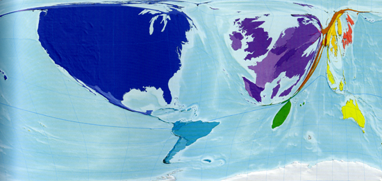
The Atlas of the Real World
All captions taken from The Atlas of the Real World:
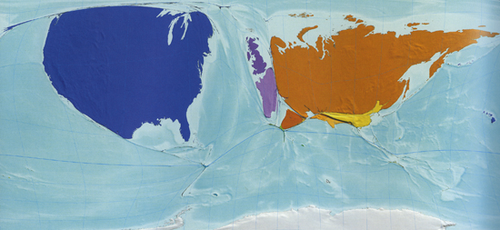
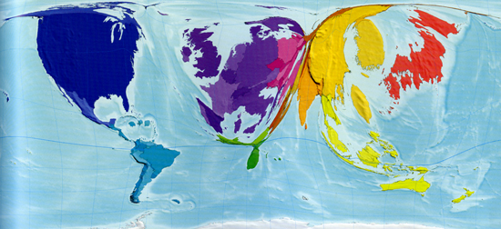
Nuclear Weapons: The size of each territory indicates the number of known or suspected strategic nuclear weapons*
“In 2002 eight territories were known or suspected to have strategic nuclear weapons: the United States, Russia, France, China, the United Kingdom, Israel, India and Pakistan… The United States, which has the largest number of nuclear weapons, has 240 times more than Pakistan, which has the fewest.” *Strategic nuclear weapons, estimated total, 2002.
——————————————
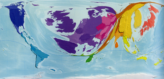
Books Published: The size of each territory shows the number of new book titles published each year*
“Each new book published is counted only once on this map, regardless of how many copies it sells… A book is defined as having at least 50 pages; a pamphlet has 5 to 49 pages. Publications with fewer than 5 pages are not shown on this map. Worldwide, about a million new book titles were published in 1999, with the largest numbers published in the United Kingdom, China and Germany. Overall, the map is dominated by Western Europe, which is home to a number of well established publishing houses.” *Books titles published, number per million people, 1999.
——————————————

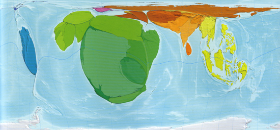
Internet Users in 1990: The size of each territory indicates the number of people using the infant internet in 1990*
“Just 3 million people worldwide had access to the internet [in 1990]: 73% of these were in the United States and 15% in Western Europe, with just a few in other places such as Canada, Australia, Japan, South Korea and Israel and practically no access anywhere else.” *Internet users in 1990, thousands.
——————————————
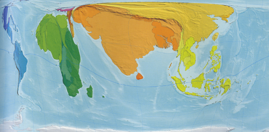
Internet Users in 2002: The size of each territory indicates the number of internet users in 2002, by which time its reach and sophistication had increased dramatically*
“The number of people using the internet saw a 200-fold increase between 1990 and 2002. By 2002 there were 631 million internet users worldwide. The distribution of users also changed radically… By 2002 there were substantial numbers of internet users also in the Asia-Pacific and Australasia, South Asia, South America, Eastern Europe and China, and small but significant numbers in Northern Africa, East and Southern Africa, and the Middle East and Central Asia.” *Internet users in 2002, users per 1,000 people, 2002.
——————————————
Forest Depletion: The size of each territory indicates the annual rate of depletion of forests, measured in terms of US dollar value at current prices*
“As quantified here, forest depletion is the net rate of loss of forests as a result of tree felling that is not offset by regrowth. The loss is measured in terms of the market value of the trees in the form of untreated round timber. In other words this map shows, at the territory level, the dollar value of wood that is not sustainably harvested… Almost half of the world total (46%) occurs in India, where the annual timber depletion exceeds that of the next 25 countries combined, althought the population of India is also almost as large as the combined population of those 25 other territories.” *Forest depletion, US$ billion, 2003.
——————————————
War Deaths in 2002: The size of each territory indicates the number of deaths directly attributable to armed conflict in 2002*
“In 2002 there were an estimated 172,000 war deaths worldwide. The majority of territories recorded none; the deaths shown here occurred in only 80 of the 200 territories, and 70% of them occurred in just 9 territories. The Democratic Replublic of Congo bore the largest share of war deaths in 2002, at 26%. As a fraction of total population Burundi was hardest hit, with 1.2 people in every 1,000 dying.” *War deaths 2002, thousands of people killed in wars.
——————————————
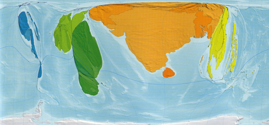
Abject Poverty - People Living on US$2 a Day: The size of each territory shows the number of people living on US$2 a day or less, adjusted for local purchasing power: barely enough to survive, let alone thrive*
“In 2002, 43% of the world’s population lived in US$2 a day or less… Where almost the entire population of a territory lives on incomes at this level, it is unsurprising if undernourishment is high, the level of education is low and life expectancy short. In both Nigeria and Mali, 9 out of every 10 people subsist on less than US$2 a day.” *Living on US$2 a day or less, millions of people.
——————————————
Number of People Living on More Than US$200 a Day: The size of each territory indicates the number of living on more than US$200 a day, adjusted for local purchasing power. Over half of these high earners live in the United States*
“A majority (61%) of the Japanese population live in households with daily incomes between US$50 and US$100, adjusted for purchasing power parity. North American and Western Europe are also particularly large on this map, while South Asia and Central Africa have almost completely disappeared.” *Living on over US$200 a day, % of population.
——————————————
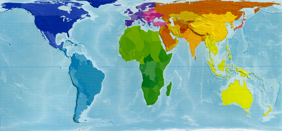
Land Area: The size of each territory represents exactly its land area in proportion to that of the others, giving a strikingly different perspective from the Mercator projection most commonly used
All images reproduced with permission.

The Atlas of the Real World is published next week from Thames & Hudson, (£29.95)
Related Links:
fabric | rblg
This blog is the survey website of fabric | ch - studio for architecture, interaction and research.
We curate and reblog articles, researches, writings, exhibitions and projects that we notice and find interesting during our everyday practice and readings.
Most articles concern the intertwined fields of architecture, territory, art, interaction design, thinking and science. From time to time, we also publish documentation about our own work and research, immersed among these related resources and inspirations.
This website is used by fabric | ch as archive, references and resources. It is shared with all those interested in the same topics as we are, in the hope that they will also find valuable references and content in it.
