Tuesday, August 12. 2008
Arch - OS
Et tiré de leur communication:
Related Links:
Personal comment:
Déjà posté un peu plus bas, mais peut-être y jeter un oeil avec comme point de comparaison Rhizoreality? Peut-être y aurait-il un développement à mettre en commun? L'idée d'un software (OS?) qui aide à faire communiquer les ressources matérielles et digitales (immatérielles) d'une architecture dans le cadre d'un projet est en tout cas commune au deux approches logicielles.
Maps, Information design & architecture
 At the end of last month, I attended the International Symposium on Electronic Arts (ISEA), that was held in Singapore. Although the juried exhibition of art works didn’t involve that many works on the themes of The Mobile City, the ISEA seminar had quite a few sessions on media technology and the experience of place and space. Unfortunately, there were so many parallel sessions, that I can’t pretend to come even close to a overall wrap-up of the conference. So I will just pinpoint some of the themes and works that I found interesting in a few posts in the next few days or so.
If there was one trend that struck me at ISEA, it was probably the idea of data visualization as a way of making abstract or invisible cultural processes more tangible. It wasn’t only the topic of some of the artist presentations, but also the core of Lev Manovich’s inspiring closing talk.
The idea is that now that we have more content and metadata than ever (Lev Manovich: this is not the era of ‘new media’ any longer, but rather the era of ‘more media’), interesting cultural forms are emerging from aggregating, analyzing and visualizing this data. Examples range from from simple tag clouds that tell us what people are talking about on the web to visualization of traffic flows in the city and systems that monitor epidemic outbreaks. In business these mappings of aggregated data are called ‘dashboards’.
Lev Manovich pointed out that companies have had these dashboards for some time, but that the cultural sector is only now catching up. Right now, these mappings are becoming a new cultural form in themselves. Just look at websites like Visual Complexity , CultureVis, Infosthetics and Information Esthetics.
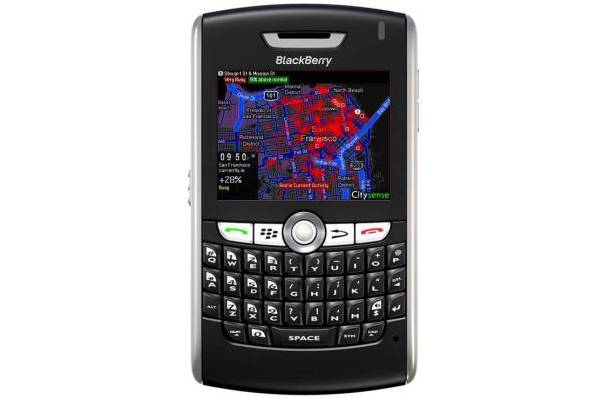
Of course locative and mobile media play an important role in this process. First of all mobile phones are often used as tracking devices. Usage data from mobile phone operators can be used to analyze movement through a city for instance. At the same time, these devices can function as dashboards to their users: mobile phone widgets can show them actual real time analysis of certain social processes in the city. But is not only about mobile devices: these visualizations can become a part of architecture as well, or displayed on urban screens.
While all of this is interesting in itself, of course the more interesting question is how to go beyond mere ‘dashboarding’ and mapping of flows? How can we turn these display of statistics in interesting pieced of public art? And how will these maps influence our experience of both the city and our social relationships?
Some examples of this trend that were shown or referred to at ISEA:
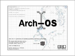
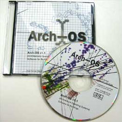
Arch-OS was presented by Mike Philips. It is a system that can collects all sorts of data from a building, varying from movement in the building by analyzing the images of cctv camera’s and internet traffic on the LAN to climate data. These data streams can then be used to drive different architectural features, varying from visuals on LED screens to a giant wall sized robot that moves through the open space of an atrium.
An ‘Operating System’ for contemporary architecture (Arch-OS, ’software for buildings’) has been developed to manifest the life of a building and provide artists, engineers and scientists with a unique environment for developing transdisciplinary work and new public art.
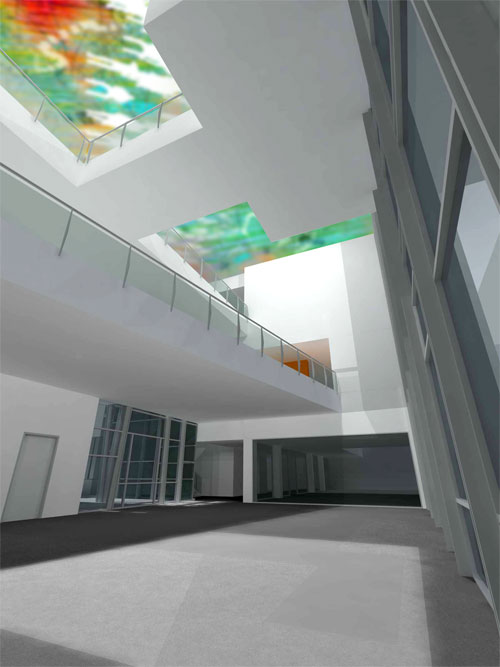
Paul Thomas showed his i-500 project, an art work that is part of a new building for Curtin University’s new Minerals and Chemistry Research and Education Buildings. It uses the Arch-Os to analyze the work of the scientists in the building and translates their activity into a public art work that is an integral part of the building.
Working in close collaboration with Woods Bagot Architects, as part of the architects project team, the i-500 project team are creating a public artwork to be incorporated into the fabric of the complex with the intention to encourage building users to communicate and collaborate.
The i-500 will perform a vital and integral role in the development of scientific research in the fields of nanochemistry (atomic microscopy and computer modeling), applied chemistry, environmental science, hydrometallurgy, biotechnology, and forensic science. The artworks potential is to represent the visualisation of quantitative scientific research as part of the architectural environment.
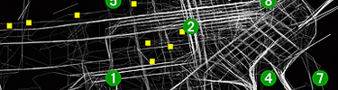
Chris Bowman and Teresa Leung are researching what looked like a ‘grammar of gps visualization systems’.
 |
Cabspotting traces San Francisco’s taxi cabs as they travel throughout the Bay Area. The patterns traced by each cab create a living and always-changing map of city life. This map hints at economic, social, and cultural trends that are otherwise invisible. The Exploratorium has invited artists and researchers to use this information to reveal these “Invisible Dynamics.
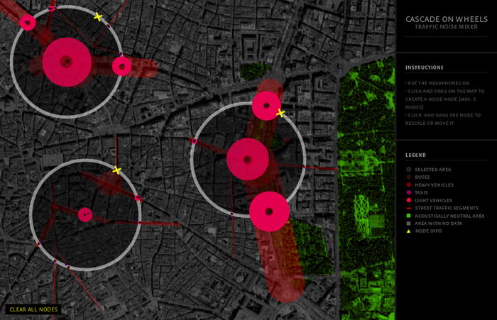 |
Cascade on Wheels is a visualization project that intends to express the quantity of cars we live with in big cities nowadays. The data set we worked on is the daily average of cars passing by streets, over a year. In this case, a section of the Madrid city center, during 2006. The averages are grouped down into four categories of car types. Light vehicles, taxis, trucks, and buses.
The project aggregated data from cell phones (obtained using Telecom Italia’s innovative Lochness platform), buses and taxis in Rome to better understand urban dynamics in real time. By revealing the pulse of the city, the project aims to show how technology can help individuals make more informed decisions about their environment.
Related Links:
fabric | rblg
This blog is the survey website of fabric | ch - studio for architecture, interaction and research.
We curate and reblog articles, researches, writings, exhibitions and projects that we notice and find interesting during our everyday practice and readings.
Most articles concern the intertwined fields of architecture, territory, art, interaction design, thinking and science. From time to time, we also publish documentation about our own work and research, immersed among these related resources and inspirations.
This website is used by fabric | ch as archive, references and resources. It is shared with all those interested in the same topics as we are, in the hope that they will also find valuable references and content in it.
