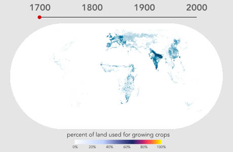
IMAGE: Screen grab showing global agricultural land-use in 1700, from World Cropland, Bill Rankin, 2009.
At Bill Rankin’s fantastic Radical Cartography site you can see an animation that shows the intensification and spread of agricultural land-use around the world over the past three hundred years.


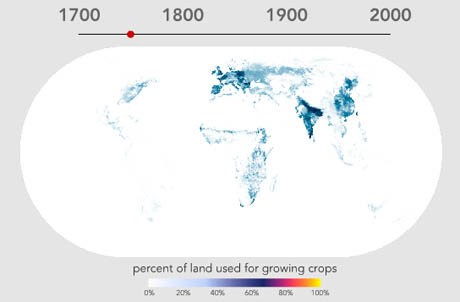
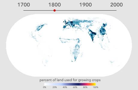
IMAGES: Screen grabs showing global agricultural land-use in 1750 and 1800, from World Cropland, Bill Rankin, 2009.
I could spend hours with these maps: for example, it’s amazing to see that agricultural activity in India in 1700 is as intensive, if not more so, than in the traditional bread-baskets of the Caucasus or the densely populated areas of Northern Europe. The persistent un-farmed patch of France’s Massif Central is also interesting: even the Alps appear to have more agricultural activity.


IMAGES: Screen grabs showing global agricultural land-use in 1850 and 1900, from World Cropland, Bill Rankin, 2009.
Rankin notes that the major trend of the past three hundred years is simply the intensification of farming practices on land that was already agricultural, “punctuated by several episodes of rapid expansion into previously untapped areas: the Great Plains in the late nineteenth century, Argentina in the early twentieth century, and in last few decades, Brazil and central India.” He also points out rare but occasional declines in agricultural density: in the “central Amazon, northern Patagonia, or the Appalachian Piedmont after World War II.”


IMAGES: Screen grabs showing global agricultural land-use in 1950 and 1992, from World Cropland, Bill Rankin, 2009.
You might be wondering how Rankin knows what percentage of land was used for growing crops in 1700, before much of the world had even been charted, let alone systematically analysed in terms of land-use.
The dataset on which Rankin’s animation is based was developed by Navin Ramankutty and Jonathan Foley, whose methodology relied on an assessment of global agricultural land in 1992, at “5 min spatial resolution” (about 10 km at the equator), by “calibrating a remotely sensed land cover classification data set against cropland inventory data.” They then compiled an “extensive database of historical cropland inventory data, at the national and subnational level, from a variety of sources,” and processed that information through their 1992 land cover/inventory algorithm, in order to arrive at a historical reconstruction.
As Ramankutty and Foley freely acknowledge, the resulting map is a guess, albeit an extremely educated one that also matches what we know of “the history of human settlement and patterns of economic development.”
As always, much of the interest in maps like these lies in thinking about what is or isn’t measured—and why. Personally, I’m intrigued by the intensification metric, and the visual implication, as Bill Rankin puts it, that “many agricultural areas are at close to 100% exploitation.” This doesn’t seem quite right: Ramankutty and Foley are measuring agricultural land use (and only at a resolution of about 10 km at the equator), not productive potential. After all, surely an area of land could be solely devoted to agriculture and yet produce wildly differing yields depending on the crops sown and the farming techniques used?

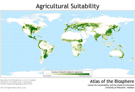
IMAGE: Map showing the suitability of land for agriculture. The map (larger view here) is derived from more data sets developed by Ramankutty and Foley, available at the Atlas of the Biosphere.
Elsewhere, Ramankutty and Foley have also collaborated to map agricultural potential, based on “the temperature and soil conditions of each grid cell.” Somewhat implausibly, since agriculture both shapes and is shaped by human civilisation, the suitability rating ignores human inputs—urban sprawl, artificial irrigation, topsoil creation—altogether.
Stepping even further away from plausibility (and human intervention), Ramankutty and Foley subsequently produced a fascinating map of potential vegetation, showing “the vegetation that would exist at a given location had human forms of land use never existed.”

IMAGE: Map of potential vegetation. The map (larger view here) is derived from more data sets developed by Ramankutty and Foley, available at the Atlas of the Biosphere.
It is an alternate surface of the earth, carefully surveyed and classified by a human civilization that could not have existed in order for it to be a reality.
On a similar note, Colorado State University researcher David Theobald has designed a new system for evaluating and mapping the “naturalness” of a landscape. In his review, Rob Goldstein describes Theobald’s methodology thus:
Specifically, Theobald used existing land use data to apply scores at a scale of 30 metres. Urban/built-up areas, roads and cropland were assigned a score of “0.” Natural areas (i.e. forests, grassland, wetlands, etc.) were assigned a score of “1.” Roads and rural development negatively impacted the scores of adjacent areas.
Using this technique, Theobald arrived at “a natural landscape score of .6621 for the conterminous United States in 2001.” In other words, the lower forty-eight states are sixty-six percent “natural,” and only one-third human-designed, or “unnatural.”
The project seems flawed on several levels (it is somewhat incredible that Owens Valley, with its hijacked river and poisonous lake-bed, could receive the “highest naturalness” scores under any rubric), but the paradox of its premise is fascinating—that a pure form of nature can be carefully located and recognised as such by humans whose activity otherwise renders impossible its very existence.
Theobald suggests that his system is a useful tool for conservationists seeking to prioritise their efforts. To me, however, it is more interesting as a geographic expression of impossible nostalgia—the land-use database equivalent of medieval monks calculating how many angels could dance on a pin.
