Thursday, January 07. 2010
Dot Dash Darwin

Graphics and lighting combine in this installation at the University of London campus's Darwin Walk
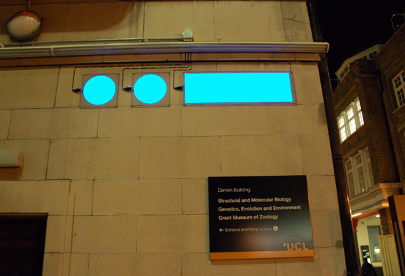
The installation is part of an ongoing project by Max Fordham Consulting Engineers to create innovating lighting across the campus. Darwin Walk runs along the side of the Darwin Building. To illuminate it, Nick Cramp, an engineer at Max Fordham, used Light Tape to spell out Darwin's name in Morse Code.
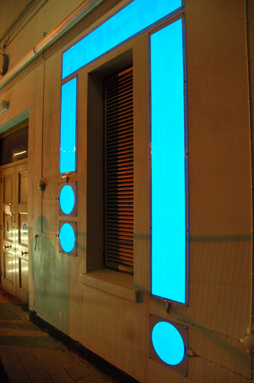
Light Tape is an electroluminescent material that can be used as an energy efficient alternative light source. It's just 6mm thick and can be cut to shape.
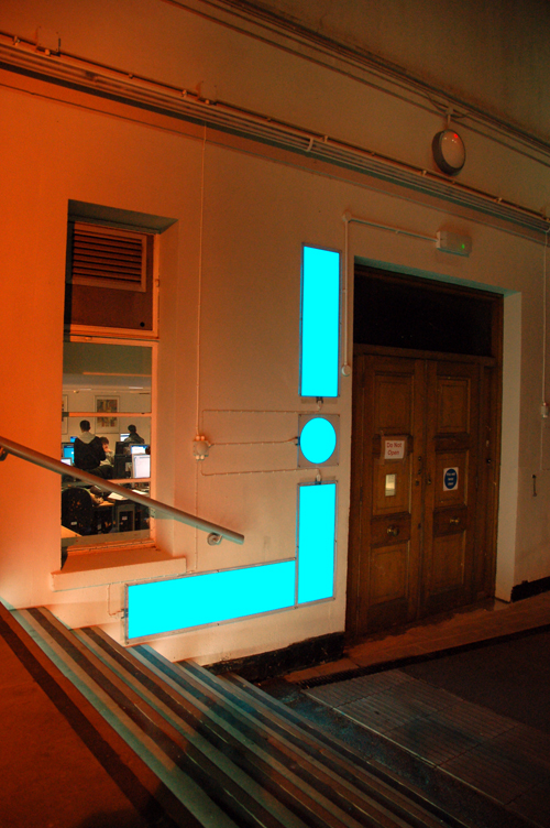

Images courtesy Light Tape
-----
Via Creative Review
Personal comment:
The result is a bit obscure... but still an interesting graphic use of luminescent plates in combination with a building's facade and its own electric illumination.
Tuesday, January 05. 2010
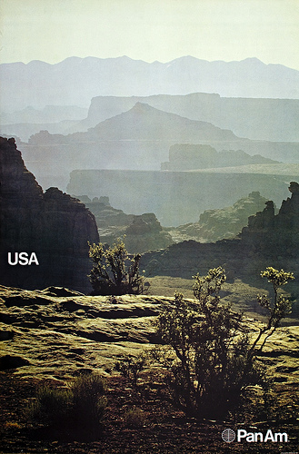
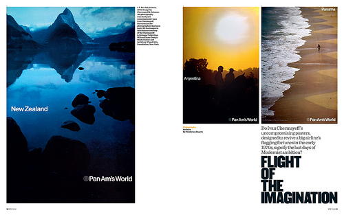
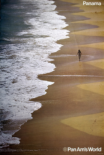
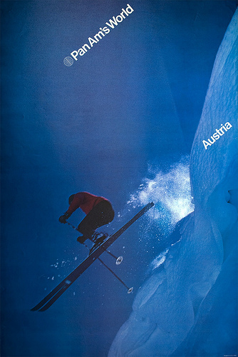
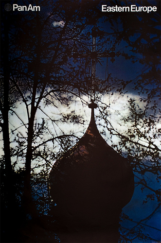
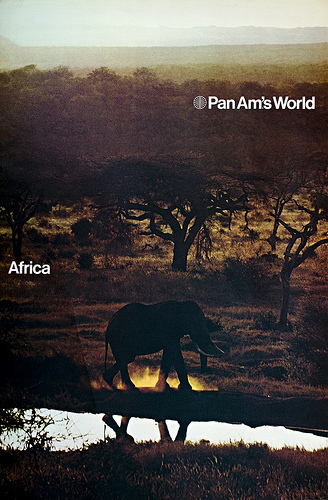
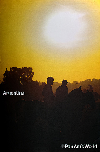
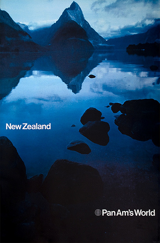
Pan Ams Helvetica dreamtime. How I unearthed a forgotten chapter in corporate design history
I came across six Pan Am posters while visiting the ‘Here Is Every. Four Decades of Contemporary Art’ exhibition at the Museum of Modern Art in New York, writes Frederico Duarte
At the time I was looking for a subject for my ‘Design as Protagonist’ project, part of Steven Heller’s Researching Design class at D-Crit (the MFA in Design Criticism at the School of Visual Arts). Also known as the ‘No Google Class’, this course urges students to find more about a designed object without recurring to Internet search engines, in order to build a narrative around its manufacture, design, application and influence.
When asked if he knew these designs, Heller replied: ‘I don’t know the posters, but would love to know more. It also goes to the heart of how “modern” Pan Am was in its approach to graphics. Worth a book.’ I knew I was on to something.
At MoMA’s Architecture and Design archive, cataloguer Paul Galloway found ‘a whole lot of nothing’ on the posters apart from the 1972 shipping receipts. At the Chermayeff & Geismar (C&G) collection at SVA’s Milton Glaser Design Study Center and Archives, archivist Beth Kleber showed me other posters and materials from that period, which proved MoMA’s six were part of a larger set, but nothing else. I never got a reply from the Pan Am archives at the University of Miami. I simply had to go to the sources to find my answers.
Below: Opening spread from ‘Flight of the imagination’, Frederico Duarte’s article about the Pan Am posters in Eye 73.
What followed could be an experiment on the six-degrees-of-separation theory. On the week I contacted the C&G studio, Michael Bierut told me during his first class he knew the posters and how to reach Bill Sontag, a designer at C&G who worked on them – via Joseph Bottoni, a professor at the University of Cincinatti, Bierut’s alma mater.
I later met with Ivan Chermayeff himself, after speaking on the phone with Bottoni, Sontag and Bruce Blackburn – another designer who worked at C&G and whom MoMA – still – wrongly credits as an author of the Bali poster.
While looking at the posters for the first time in decades (including one which according to him could not have been designed at C&G and was swiftly thrown away), Chermayeff told me a few interesting anecdotes about the redesign, but not the whole story. The same day I met with George Tscherny, who also worked for Pan Am and whose work is also in the SVA archive. He gave me Patrick Friesner’s email and told me to get in touch with him: our correspondence began that evening. Friesner, a Briton now living in northern Dordogne, was at the time – under CEO Najeeb Halaby – Pan Am’s Head of Sales Promotion (not of Sales and Promotion, as I wrongly stated in the article). In his many witty and insightful emails, he revealed to me the fascinating process behind Pan Am’s short-lived Helvetica dream.
But I still wanted to understand how these posters ended up in MoMA. Chermayeff told me he was not involved in the acquisition process, despite being a trustee and consultant at the time. I then wrote to Christian Larsen, who while at MoMA’s A&D department almost included the Hawaii poster in the 2007 Helvetica exhibition he curated. Larsen got me thinking if Mildred Constantine, MoMA’s Associate Curator of Graphic Design from 1943 to 1971, had acquired the Pan Am posters during her last year at the museum, as part of her many other ‘Swiss school’ acquisitions from the likes of Armin Hofmann, Josef Müller-Brockmann, Manfred Bingler, Tomoko Miho and Massimo Vignelli. That would explain why there are no posters from 1972, only from 1971, in the collection (an easy way to tell the date: Logo + Pan Am = 1971, Logo + Pan Am’s World = 1972).
Connie Butler, MoMA’s current Robert Lehman Foundation chief curator of drawings who included the Chermayeff’s posters in an exhibition dedicated to the past 40 years of the museum’s collection, told me on the phone how surprised she was with their success: she got more feedback from fellow curators and artists about them than about any other of the more than 100 works on show.
Then, on the day we handed our research results (in the form of posters and books) to Steven Heller, Emily King visited our department on West 21st Street. While looking at my poster, she said ‘I think Alan Fletcher did work for Pan Am, too.’ Friesner had never mentioned Fletcher, but I also didn’t ask. By then I could finally Google the words “Pan Am Posters”, so I did. Not only I got immediate proof Fletcher had indeed worked for Pan Am, I later learned from Friesner how he got the job – another six-degree-of-separation-story, worthy of its own blog post: think Mad Men with extra air miles.
Another thing I learned from Google was that none of the people running the many Pan Am memorabilia websites, dedicated as they can be, seems to have even heard of these posters. Few have found any of the materials designed between 1971 and 1972. Judging by these sites (or eBay, for that matter) it was as if this redesign never existed.
Pan Am is no longer. But the story of its redesign, as told by the people behind it, proves personal connections, proximity and chance are all makers of (design) history. How many other great design stories are left untold?
You can read Frederico Duarte’s article ‘Flight of the imagination’ on the Eye website and in Eye 73, a photography special issue.
Eye is available from all good design bookshops and online at the Eye shop. For a taste of the magazine, try Eye before you buy.
-----
Via Eye Magazine
Personal comment:
I found this old PanAm ad campaign interesting. For many different reasons: both for its quality and nowadays old flavoured "dream destinations". But it tells something to me about the early ages of tourism and globalisation where distant location where still strange, mysterious and "magical". The ad was about that at least, and it sounds now old flavoured isn't it?
Thursday, November 19. 2009
Processing thoughts
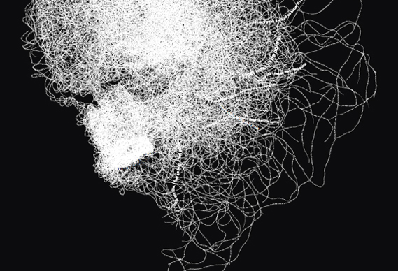
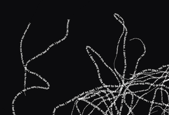
McCann Erickson Manchester has created a poster campaign for a mental health organisation that combines photography and Processing to great effect
The two six sheet posters are for Leeds Counselling and will appear in doctors' surgeries, clinics, student halls and other suitable locations throughout Leeds.
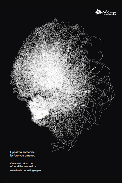
They feature faces are made of ‘strings of type’ recounting the types of issues people need to discuss at counselling. The images were created by San Francisco-based ‘Scloopy’ using a piece of software he wrote in Processing.
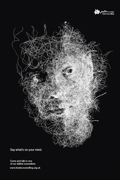
"We supplied him with black and white shots (by photographer Steve Deer) and text," explains McCann creative partner Richard Irving. "The software takes the image and draws little lines all over it. The tips of the lines look for brightness in the image. It acts like a fungus and grows in real time to produce the finished result. No two images are ever the same, even if the same info is used."
Irving says that there are plans to create a 'live' version of the process for the web and possibly a cinema commercial.
See more of Scloopy's work here
-----
Via Creative Review
Friday, July 17. 2009
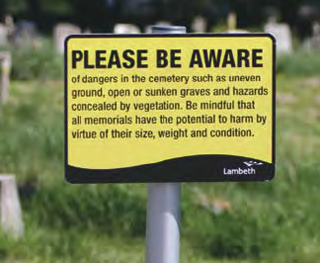
All memorials have the potential to harm
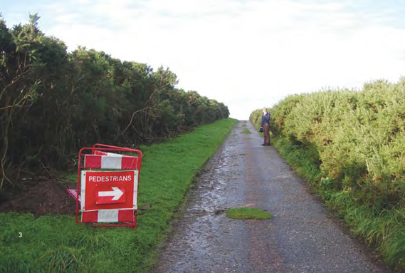
A nice walk, spoiled (by utterly pointless signage). Image by Kate Gordon Roger, Morayshire
The Manifesto Club is an organisation that campaigns against the hyperregulation of everyday life and the increased threat to public freedoms. Their new book, Attention Please, is a collection of photographs that document the use of prescriptive safety signage that, far from alerting people to imminent danger, merely highlights the absurd policing of ordinary people doing ordinary things...
This printed version of the original Attention Please online gallery (that began in 2007) includes a selection of pictures of "pseudo-safety signage", as the Manifesto Club's Josie Appleton writes in her introduction.
The book, designed by St Pierre & Miquelon, features images of cones surrounding innocuous tree stumps, yellow 'privacy zones' outside cashpoints, and the countless site-specific warning signs that can really, really annoy (not to mention impinge upon a nice view).
Take the following picture of some presumably long-aged gravetones in a cemetery in Tooting, London, for example:
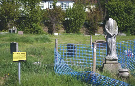
Not content with erecting a tasteful blue plastic fence around a (admittedly headless) statue, Lambeth council alert all passing visitors – not to mention mourners – that some of the traditionally static blocks of marble and sandstone may, in fact, cause harm:
Images by Timandra Harkness, Tooting, London
Check out exactly what's being cornered-off in these examples of some decidedly over-zealous fencing:
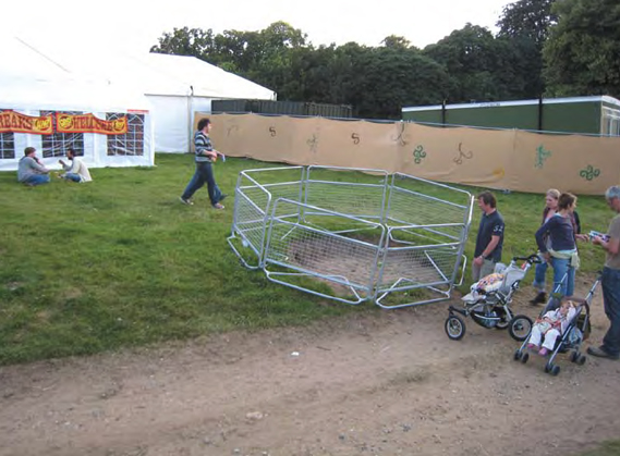
Image by Simon Elvins, Latitude Festival, Suffolk
A patch of bare earth. But it is on a slight incline. Careful now.

Image by Simon Elvins, Lisbon

Image by Dan Shadbolt, Highgate, London
Amusing as these images and most of the ones in the book are; the Manifesto Club's point is far from a joke.
They believe that the hundreds of instances where signage no longer signifies a significant risk are, in themselves, detrimental to public life, particulary to our enjoyment of public space.

Image by Ryan Ras, Hyde Park, London
Walk down any high street (and this is in no way unique to the UK) and the proliferation of ugly, unnecessary and patronising safety signs is overwhelming.
You don't have to look hard for example either – the stripey tape, the orange cones and lines of yellow paint can make an appearance in the most innocuous of places.
Can you spot the steps in this picture of the entrance to a Leeds University building? (Clue: they're just behind the trees).
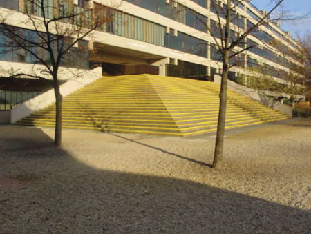
Image by Mark Harrop, Leeds University
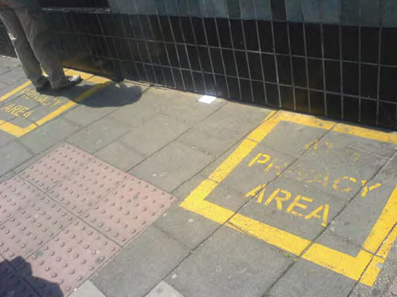
Safe banking, thanks to an ATM PRIVACY AREA. Image by Josie Appleton, Brighton
But, worryingly, as Appleton states in her introduction, what's happening more and more is that "caution [is being] integrated into design itself."
Next time you're on a new Virgin train, check the carriage doors from the inside. Each one has multiple day-glo stripes and built-in warning lights. Safety first, or just excessive?
In this case, far from being council busy bodies who need to rein in their use of signage, it's designers who have the opportunity to stop the spread of this virulent visual disease.

Image by Matthew Barnes, Southwark, London
This one, however, can stay.
Attention Please is published and distributed by Manifesto Club and is available to buy, here, for £12 (plus p&p). The book is edited and designed by Josie Appleton and the design group, St Pierre & Miquelon.
-----
Via Creative Review
Related Links:
Monday, July 06. 2009
Merce Cunningham's Dancing hands
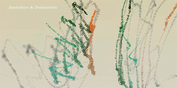
Ascenders & Descenders is a typographic reinterpretation of Merce Cunningham's dancing hands as recorded by OpenEnded Group for the Loops project.
The piece is a Cunningham dance work reconstructed from textual deconstructions of other Cunningham dance works. Each finger has an associated excerpt from an article, review, or essay on Cunningham from the last 5 decades. These texts become the "ink" with which each finger manifests its movements. Each text is dynamically typeset in 3 dimensional space along the curves traced by his fingertips.
The software keeps track of various movement parameters which it uses to modulate aspects of the visualization such as letter size, camera position, angle, and zoom. Merce not only dances the dance, but becomes typesetter and cinematographer, conducting the audience's view of the dance.
What, from the outside, appear to be subtle manipulations of the hands become a beautiful tangle of diving flocks and waterfalls of letters. Presenting dance in this way, we hope to get closer to the experience of the dance from the inside out.
Watch the video below.
Thnkx John.
-----
Related Links:
Personal comment:
Une approche 3d-générative des "dancing hands" de Merce Cunningham.
Wednesday, April 08. 2009
Buchstabenmuseum


The aim of the Buchstabenmuseum (Museum of Letters, Characters and Typefaces) is the preservation and documentation of letters, regardless of culture, language and font systems. Letters stand at the interface between written and visual culture. They are the basic elements of all semiotic textual traditions and written communication.
Letters are ciphers with characteristic shapes and diverse materiality. They carry images, they flow together as tattoos, or can be savored as pasta and pastries. As a result of the increasing homogenization of the urban landscape quality crafted letters and signs are vanishing from public spaces. Due to the disappearance of traditional companies, and also due to revisions of wordmarks and the rise of the Corporate Logo, regional and historic characters become extinct and are lost.
The Museum of Letters works both as a »recycling« company as well as an archive. The museum collects objects that semiotically act as signifiers in the ABC, that carry meaning independent of their material embodiment, in their diversity of functions and across the whole aesthetic bandwidth.
Planed is a museum space in the traditional sense with unconventional exhibits. The Museum of Letters wants to awaken the public’s interest and awareness in typography, and the collection itself. So far there is no comparable museum dealing exclusively with the letter as a contentfree sign.
The magic of the museum unfolds in the detachment of the objects from their actual context, and in future will delight many visitors, from first graders to academic theorists and street artists to design enthusiasts.
Berlin
-----
Via Manystuff
Personal comment:
Un probablement futur beau musée dédié à la lettre et à la typographie (mais avec une approche pas trop technique et plutôt très visuelle), à Berlin.
Tuesday, March 03. 2009
6 Ways to Publish Your Own Book
 Shevonne Polastre is a freelance Technical Writer who assists companies and non-profits. She authors FreeAgentWriter, a blog about the technology world.
Online self-publishing services have given users the tools they need to create, publish and promote their work. These sites allow authors to bypass the process of finding an agent and pitching to publishing houses, a venture that can take months, if not years.
Here are six great sites that will help you publish your work, guaranteeing you a published book that can be sold via different outlets, such as Amazon.
Have another service to suggest? Tell us about it in the comments.
1. Lulu
Lulu allows you to create a variety of books, but also lets you develop digital media. These range from music and ringtones to videos and e-books. With Lulu, you can also scan and digitize your old books, albums, and photos. You are given the option of leaving the book in private view or releasing it to the public.
Before finalizing the book, you are able to download and print a proof of the book, and when your book is ready, you are able to sell it in your customized storefront. Users are able to use Google Book Search (Beta), which puts your book content in Google’s search results. When viewers click on the link, they are taken to a Google-hosted web page that links to Lulu. Lulu also provides groups that allow you to sell your book with similar books in a group storefront. Group members share a group blog, forum, and find like-minded individuals for future collaboration efforts.

What makes it unique: Lulu provides an FTP site for uploading files larger than 300MB. In addition, you are able to distribute to third-party sites, such as Amazon and Barnes & Noble, by purchasing a distribution package.
What it’s missing: You are not able to build your own templates or layouts.
Pricing: Softcovers start at $7.60 and hardcovers at $17.48
2. Blurb
Blurb allows anyone to create any kind of book, from nonfiction to photo, recipe, and more. You can use one of their templates and layouts or import your own design. Once you’ve created your book, you can choose between making the book open to the public or keeping it private. If you choose to make your book public, it can be sold on the Blurb website. Additionally, you can opt to offer readers a preview of the first 15 pages of your book to help them decide if they want to make a purchase.
To increase your search ranking, you are able to add subtitles, tags, categories, and descriptions. If you are in need of assistance, you can contact a “Custom Bookmaker,” an independent provider who can help you in your book development.

What makes it unique: Blurb offers BookSmart, free software that assists you in developing your book. If you use Typepad or LiveJournal, you are able to import blog entries to create your book. Additionally, Blurb allows you to import images from Flickr, Picasa, and SmugMug. If you are using a Mac, it also integrates with your iPhoto library.
What it’s missing: You are not able to build your own templates or layouts, though you are able to import your own design. Also, the BookSmart software drastically slows down your computer, and there is no online writing collaboration, only photos.
Pricing: Softcovers start at $12.95 and hardcovers at $22.95
(Disclosure: Mashable is partnering with Blurb for our event at SXSW)
3. CreateSpace
CreateSpace was acquired by Amazon in 2005, and similar to Lulu, it provides book publishing and digital media development. Because CreateSpace is a subsidiary of Amazon, it’s easier and quicker to sell your book through Amazon. Like the other sites, you are able to choose between making your book open to the public or private. The only format accepted during the submission process is PDF, which is for both text and images.

What makes it unique: CreateSpace is the only one of the self publishing services that provides you the ability to create your book in Kindle format. Additionally, you are able to immediately assign an ISBN or use an existing one.
What it’s missing: There is no option to create hardcover books. Also, while users can participate in the CreateSpace message boards, it’s lacking some of the social media tools, groups, and messaging that other self-publishing services provide.
Pricing: Standard B&W starts at $3.66 per book; Standard Color starts at $6.55. You can also upgrade to their Pro Plan, which is $39.00 per book. The Pro Plan allows you to keep more from each sale, and pay less when ordering copies.
4. CafePress
CafePress provides a way for people to sell their creations in “shops.” It is a marketplace with over 150 million products (i.e. clothing, gifts, books, etc.). They also provide you with the ability of self publishing your books. Like the others, CafePress also has private and public options. While you are able to upload your book in PDF format, it has to be less than 100 MB. There are different templates you can use based on the type of book you are trying to publish, and you can tailor it the way you see fit.

What makes it unique: CafePress sells a variety of items, such as books, cds, clothing, art, etc. You do not have to be a member to use their self-publishing service.
What it’s missing: There is no option to create hardcover books and it doesn’t have the ease of site navigation like the other services.
Pricing: Prices start at $0.045 per page and a $4 binding fee.
5. WeBook
WeBook combines the joys of self publishing with social media. You are able to write a book alone or collaborate with other writers. The site provides an online text editor for you to write, and you are able to add images from image-hosting sites like Flickr, Photobucket, Picasa, etc.
There are two levels of privacy: You can choose who is able to view your writing, and who is able to write the story. Throughout the year, WeBook has submission periods in which you are able to submit your book for consideration for publishing. You can choose to share your royalties with people who have given you helpful feedback and assisted in the development of your book.

What makes it unique: You are able to collaborate with different writers, and be part of various groups. Writers rate and review submitted books, and the ones with the highest ratings are published by WeBook. Additionally, you can share your royalties with selected reviewers who have provided you with helpful feedback.
What it’s missing: There is no option for you to publish your book, if you desire. It is all dependent on the rating you receive. Also, you are not able to import from another word processor or PDF.
Pricing: $0
6. Xlibris
Xlibris was founded in 1997 and is one of the first self publishing services in the industry. You start the process by having a consultation with one of their consultants about your needs and the correct package to fit those needs. They create the full design of the book and send it to you for feedback and approval. After that, the book is yours and you are able to sell it wherever and to whomever you want.

What makes it unique: You get a free consultation to ensure that you are on the right path. Additionally, they offer leather-bound editions of your book.
What it’s missing: Competitive prices and private/public options.
Pricing: Prices start at $299
More writing resources from Mashable:
Image courtesy of iStockphoto, kate_sept2004
---
Related Articles at Mashable | The Social Media Guide:
10 Ning Networks to Help You Land Your Next Job
Send Your vCard to Any Contact on Any Device Using BeamME Pro for iPhone
Mashable’s Weekly Social Media & Web Event Guide
SXSW
-----
Via Mashable
Personal comment:
Ressources, si on souhaite se faire un "self-published" book. L'aspect intéressant d'une telle démarche est évidemment qu'il n'y a pas à "payer"pour produire un certaine quantité de livres qui ne seront pas forçément tous vendus, qu'il ne faut poas payer non pus pour lr réseau de l'éditeur. La contre-partie est évidemment qu'il n'y a, justement, pas de réseau de distribution autres que son propre site web, les blogs et j'en passe de la "self-communication"!
Friday, January 09. 2009
The History of Visual Communication
Artist, designer and educator Elif Ayiter presents "The History of Visual Communication" [citrinitas.com], a dedicated website that focuses on the history of the translation of ideas, stories and concepts that are largely textual or word based into a visual format, i.e. Visual Communication.
Structured into 10 sequential chapters, starting from "Rocks and Caves", over "Ideograms" and "The Alphabet", and ending at the era of the "The Computer", the site attempts to give a complete but very brief overview of the history of typography, illustration, illumination, photography, shapes, color and computer graphics imagery. It also contains many images, most of them in high (presentation friendly) resolution.
You might also be interested in the Atlas of Cyberspace.
-----
Related Links:
Personal comment:
Réductrice et discutable comme toute sélection historique, le site présente un "hyper-résumé" d'une histoire de la communication visuelle qui n'en demeure pas moins intéressante.
Friday, November 14. 2008
Geometrophilia

Kapitza, the design studio of sisters Nicole and Petra Kapitza has just released a book for all you geometrophiles out there. Geometric: Graphic Art and Pattern is chock full of 264 coloured and black and white patterns with 100 pattern fonts on an accompanying CD…


The disc apparently contains the most extensive pattern font collection available and includes a helpful font index and a series of tutorials so users can generate their own unique patterns.


Geometric is also beautifully put together. The book is printed on heavy matte stock, with an embossed cover wrapped in an American-style poster (it’s very nice, see below).


The book is available now from Magma bookshops in the UK; £55.
More details at kapitza.com
-----
Via Creative Review
Related Links:
Wednesday, October 29. 2008
A Real No Hoper


Alfred E. Neumann, MAD magazine’s jug-eared mascot is the latest in a long line of parodies of Shepard Fairey’s classic Hope poster of Barack Obama. Turns out that the image adorning the latest issue of the mag, #495, is actually Fairey’s favourite…
“I’m very happy that the Hope poster has become such a point of reference,” Fairey wrote in response to poster blogger Rene Wanner’s online collection of parodies. “One parody that is not included is something I consider a high point in my career for pop culture recognition. MAD Magazine’s new cover is a spoof of my Obama image. I loved MAD as a kid. I think MAD’s satire heightened my understanding of irony and hypocrisy. I’m very excited to be a part of MAD’s history.”
Wanner has now updated his ever-growing list of Hope posters on his fantastic resource, posterpage.ch, so it includes the cover of the new edition of MAD among a host of good and, er, not-so-good efforts.
Related Links:
fabric | rblg
This blog is the survey website of fabric | ch - studio for architecture, interaction and research.
We curate and reblog articles, researches, writings, exhibitions and projects that we notice and find interesting during our everyday practice and readings.
Most articles concern the intertwined fields of architecture, territory, art, interaction design, thinking and science. From time to time, we also publish documentation about our own work and research, immersed among these related resources and inspirations.
This website is used by fabric | ch as archive, references and resources. It is shared with all those interested in the same topics as we are, in the hope that they will also find valuable references and content in it.
Quicksearch
Categories
Calendar
|
|
May '24 | |||||
| Mon | Tue | Wed | Thu | Fri | Sat | Sun |
| 1 | 2 | 3 | 4 | 5 | ||
| 6 | 7 | 8 | 9 | 10 | 11 | 12 |
| 13 | 14 | 15 | 16 | 17 | 18 | 19 |
| 20 | 21 | 22 | 23 | 24 | 25 | 26 |
| 27 | 28 | 29 | 30 | 31 | ||
