Tuesday, May 26. 2009
Memorial Day - Map the Fallen in Google Earth
Back in November of 2005, a Google Earth Community member posted the first version of a map showing US and Coalition soldiers who made the ultimate sacrifice in the Iraq and Afghanistan conflicts. He worked with other members of the Google Earth Community to refine the map over time - and worked hard to focus on just providing a memorial to these fallen soldiers - not provide a political statement about the war. Since 2005, Sean Askay worked on his master's thesis involving Google Earth and sensor networks to monitor a protected wilderness, and after landing a job at Google, has been working for the Google Earth Outreach team helping organizations create content to make people aware of environmental and human issues around the world.
Meanwhile, using his 20% time at Google, Sean continued to refine the casualties map, and his knowledge of KML has also advanced. He has produced one of the most sophisticated, yet elegant, and very informative KML files I've seen to date (and I've seen a lot of KML in the last 4 years!). View the map here  (Google Earth 5 required) which appears on his Map the Fallen blog. According to Google (which posted this on their Lat Long Blog):
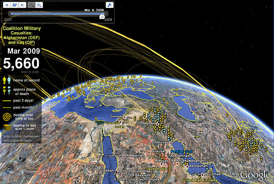
Sean uses over 24,000 placemarks, 6,000 folders, 2,500 screen overlays, and line arcs with over 250,000 vertices, all to create an immersive and compelling user experience. By making extensive use of Google Earth 5.0's new features, including iframes, CSS and JavaScript support in balloons and time-based navigation, you can now fly to a place and time. With a blend of navigation methods, people can look up information about servicemen and women alphabetically, by age, location or chronology.
You should read what Sean himself says about the collection. Sean worked with GEC moderator Warrant Officer Frank McVey, a retired member of the UK's Royal Air Force, who worked many hours to help with the collection.
-----
Personal comment:
Un projet un peu morbide je l'admets, cartographier les morts des guerres en Irak et Afganistan... D'où ils venaient, où ils sont morts. Et ça commence à faire bcp de morts... Etonnant de voir aussi les informations qu'on peut en tirer: d'où viennent majoritairement les soldats et quelles sont les zones à éviter... Bizarre projet de "mapping".
Ce serait "intéressant" (et certainement instructif) d'avoir l'équivalent irakien ou afghan... Combien? 50, 100 x plus de morts?
fabric | rblg
This blog is the survey website of fabric | ch - studio for architecture, interaction and research.
We curate and reblog articles, researches, writings, exhibitions and projects that we notice and find interesting during our everyday practice and readings.
Most articles concern the intertwined fields of architecture, territory, art, interaction design, thinking and science. From time to time, we also publish documentation about our own work and research, immersed among these related resources and inspirations.
This website is used by fabric | ch as archive, references and resources. It is shared with all those interested in the same topics as we are, in the hope that they will also find valuable references and content in it.
Quicksearch
Categories
Calendar
|
|
April '24 | |||||
| Mon | Tue | Wed | Thu | Fri | Sat | Sun |
| 1 | 2 | 3 | 4 | 5 | 6 | 7 |
| 8 | 9 | 10 | 11 | 12 | 13 | 14 |
| 15 | 16 | 17 | 18 | 19 | 20 | 21 |
| 22 | 23 | 24 | 25 | 26 | 27 | 28 |
| 29 | 30 | |||||
