Instead of clicking on all of these internal links above, you can watch all this, and much more, in less than 20 minutes below.
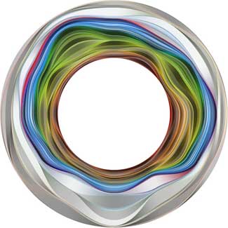
Aaron currently leads the "Data Arts Team" in the "Google Creative Lab", a team who initiated the Google Data Viz challenge and just launched their WebGL globe.
He claims that "an interface can be powerful narrative device. As we collect more and more personally and socially relevant data, we have an opportunity and maybe even an obligation to ... tell some amazing stories".
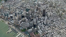
A missile-targeting technology is adapted to process aerial photos into 3-D city maps sharper than Google Earth's.
By Tom Simonite
Pixel perfect: Using aerial photos, image-processing software created this 3-D model of San Francisco, accurate to 15 centimeters.
Credit: C3 Technologies
Technology originally developed to help missiles home in on targets has been adapted to create 3-D color models of cityscapes that capture the shapes of buildings to a resolution of 15 centimeters or less. Image-processing software distills the models from aerial photos captured by custom packages of multiple cameras.
The developer is C3 Technologies, a spinoff from Swedish aerospace company Saab. C3 is building a store of eye-popping 3-D models of major cities to license to others for mapping and other applications. The first customer to go public with an application is Nokia, which used the models for 20 U.S. and European cities for an upgraded version of its Ovi online and mobile mapping service released last week. "It's the start of the flying season in North America, and we're going to be very active this year," says Paul Smith, C3's chief strategy officer.
Although Google Earth shows photorealistic buildings in 3-D for many cities, many are assembled by hand, often by volunteers, using a combination of photos and other data in Google's SketchUp 3-D drawing program.
C3's models are generated with little human intervention. First, a plane equipped with a custom-designed package of professional-grade digital single-lens reflex cameras takes aerial photos. Four cameras look out along the main compass points, at oblique angles to the ground, to image buildings from the side as well as above. Additional cameras (the exact number is secret) capture overlapping images from their own carefully determined angles, producing a final set that contains all the information needed for a full 3-D rendering of a city's buildings. Machine-vision software developed by C3 compares pairs of overlapping images to gauge depth, just as our brains use stereo vision, to produce a richly detailed 3-D model.
"Unlike Google or Bing, all of our maps are 360° explorable," says Smith, "and everything, every building, every tree, every landmark, from the city center to the suburbs, is captured in 3-D—not just a few select buildings."
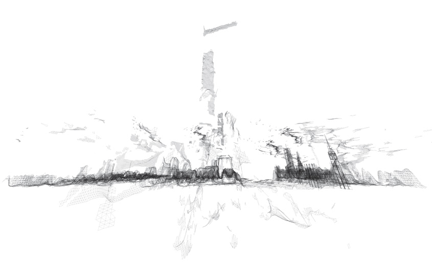
C3's approach has benefits relative to more established methods of modeling cityscapes in 3-D, says Avideh Zakhor, a UC Berkeley professor whose research group developed technology licensed by Google for its Google Earth and Street View projects. Conventionally, a city's 3-D geometry is captured first with an aerial laser scanner—a technique called LIDAR—and then software adds detail.
"The advantage of C3's image-only scheme is that aerial LIDAR is significantly more expensive than photography, because you need powerful laser scanners," says Zakhor. "In theory, you can cover more area for the same cost." However, the LIDAR approach still dominates because it is more accurate, she says. "Using photos alone, you always need to manually correct errors that it makes," says Zakhor. "The 64-million-dollar question is how much manual correction C3 needs to do."
Smith says that C3's technique is about "98 percent" automated, in terms of the time it takes to produce a model from a set of photos. "Our computer vision software is good enough that there is only some minor cleanup," he says. "When your goal is to map the entire world, automation is essential to getting this done quickly and with less cost." He claims that C3 can generate richer models than its competitors, faster.
Images of cities captured by C3 do appear richer than those in Google Earth, and Smith says the models will make mapping apps more functional as well as better-looking. "Behind every pixel is a depth map, so this is not just a dumb image of the city," says Smith. On a C3 map, it is possible to mark an object's exact location in space, whether it's a restaurant entrance or 45th-story window.
C3 has also developed a version of its camera package to gather ground-level 3-D imagery and data from a car, boat, or Segway. This could enable the models to compete with Google's Street View, which captures only images. C3 is working on taking the technology indoors to map buildings' interiors and connect them with its outdoor models.
Smith says that augmented-reality apps allowing a phone or tablet to blend the virtual and real worlds are another potential use. "We can help pin down real-world imagery very accurately to solve the positioning problem," he says. However, the accuracy of cell phones' positioning systems will first have to catch up with that of C3's maps. Cell phones using GPS can typically locate themselves to within tens of meters, not tens of centimeters.
The London-based architectural group ScanLAB—founded by Matthew Shaw and William Trossell—has been doing some fascinating work with laser scanners.
Here are three of their recent projects.
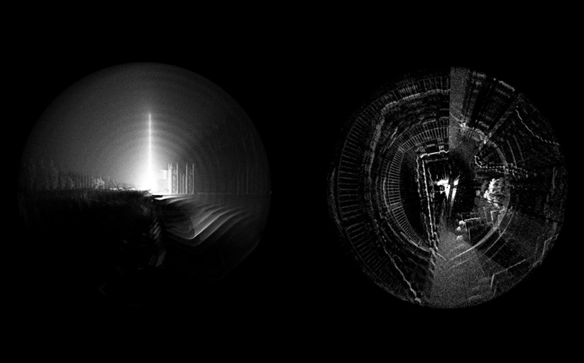
1)Scanning Mist. Shaw and Trossell "thought it might be interesting to see if the scanner could detect smoke and mist. It did and here are the remarkable results!"
2)Scanning an Artificial Weather System. For this project, ScanLAB wanted to "draw attention to the magical properties of weather events." They thus installed a network of what they call "pressure vessels linked to an array of humidity tanks" in the middle of England's Kielder Forest.
These "humidity tanks" then, at certain atmospherically appropriate moments, dispersed a fine mist, deploying an artificial cloud or fog bank into the woods.
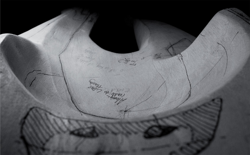
3)Subverting Urban-Scanning Projects through "Stealth Objects." The architectural potential of this final project blows me away. Basically, Shaw and Trossell have been looking at "the subversion of city scale 3D scanning in London." As they explain it, "the project uses hypothetical devices which are installed across the city and which edit the way the city is scanned and recorded."
Tools include the "stealth drill" which dissolves scan data in the surrounding area, creating voids and new openings in the scanned urban landscape, and "boundary miscommunication devices" which offset, relocate and invent spatial data such as paths, boundaries, tunnels and walls.
The spatial and counter-spatial possibilities of this are extraordinary. Imagine whole new classes of architectural ornament (ornament as digital camouflage that scans in precise and strange ways), entirely new kinds of building facades (augmented reality meets LiDAR), and, of course, the creation of a kind of shadow-architecture, invisible to the naked eye, that only pops up on laser scanners at various points around the city.
ScanLAB refers to this as "the deployment of flash architecture"—flash streets, flash statues, flash doors, instancing gates—like something from a short story by China Miéville. The narrative and/or cinematic possibilities of these "stealth objects" are seemingly limitless, let alone their architectural or ornamental use.
Imagine stealth statuary dotting the streetscape, for instance, or other anomalous spatial entities that become an accepted part of the urban fabric. They exist only as representational effects on the technologies through which we view the landscape—but they eventually become landmarks, nonetheless.
For now, Shaw and Trossell explain that they are experimenting with "speculative LiDAR blooms, blockages, holes and drains. These are the result of strategically deployed devices which offset, copy, paste, erase and tangle LiDAR data around them."
Here is one such "stealth object," pictured below, designed to be "undetected" by laser-scanning equipment.
Of course, it is not hard to imagine the military being interested in this research, creating stealth body armor, stealth ground vehicles, even stealth forward-operating bases, all of which would be geometrically invisible to radar and/or scanning equipment.
In fact, one could easily imagine a kind of weapon with no moving parts, consisting entirely of radar- and LiDAR-jamming geometries; you would thus simply plant this thing, like some sort of medieval totem pole, in the streets of Mogadishu—or ring hundreds of them in a necklace around Washington D.C.—thus precluding enemy attempts to visualize your movements.
[Images: A hypothetical "stealth object," resistant to laser-scanning, by ScanLAB].
Briefly, ScanLAB's "stealth object" reminds me of an idea bandied about by the U.S. Department of Energy, suggesting that future nuclear-waste entombment sites should be liberally peppered with misleading "radar reflectors" buried in the surface of the earth.
The D.O.E.'s "trihedral" objects would produce "distinctive anomalous magnetic and radar-reflective signatures" for anyone using ground-scanning equipment above. In other words, they would create deliberate false clues, leading potential future excavators to think that they were digging in the wrong place. They would "subvert" the scanning process.
I'm usually not a big fan of fractal visualizations, especially when they are used as visuals for techno parties... But this one is quite stunning and very close to what a fractal is: an evolving object with no defined scale, a very fascinating mathematical model. Big or small? A planet (Solaris ?) or a microbe? Living or dead?
At Spillway, Will Wiles writes about a series of contradictory tensions at the heart of SimCity:
“…there’s a sheer atavistic thrill that comes from playing the game fast and loose, with all sorts of destruction and little thought of consequences. Your urgently needed relief road happens to pass straight through a small, comfortable middleclass neighbourhood? Pah, build it anyway. Sure, you could spend the money on a neat little bus system, but isn’t a glistening motorway just a bit more swanky? Similarly, a vast stadium complex is always going to be more appealing to the ambitious mayor in a hurry, even though a well-funded local library network could yield better results for a fraction of the cost. Huge engineering projects will always be more fun to put together, and more impressive onscreen, than microscopic local initiatives. A mayor should be building suspension bridges and airports – leave the rest to Extreme Makeover: Home Edition.”
[If you are looking for more evidence that SimCity has permanently altered the way we look at cities, then the above view of Shanghai from Chinese search engine Baidu's "dimensional map" is probably a pretty good place to start; seen via @doingitwrong.]
Personal comment:
A quite amazing but a bit worrying map of Shanghai's city center by Baidu!
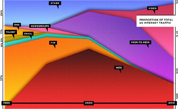
The floods in Pakistan sound bad, but just how bad are they, really? Well, if they were in America and centered around New York city, they would extend along the east coast, all the way from Canada to North Carolina:
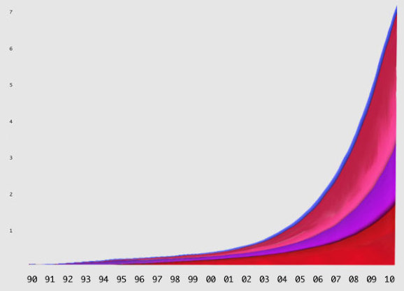
If you went with total useage, the graph might look like this:
"In fact," Beschizza writes, "between 1995 and 2006, the total amount of web traffic went from about 10 terabytes a month to 1,000,000 terabytes (or 1 exabyte). According to Cisco, the same source Wired used for its projections, total internet traffic rose then from about 1 exabyte to 7 exabytes between 2005 and 2010."
Now, using actual total traffic as the vertical axis, Beschizza reimagines the graph like this:
Does that look like "death" to you?
Personal comment:
Besides the point about web's death (we are speaking here about the "death" of a web of pages, but the increase in the spread of Internet usage) that was made by Wired as an editorial ad. and (apparently rightly) disputed here by Rob Beschizza, it is also interesting to see how far an information graphic can deceive its readers depending on what value you put on which axis...
It's an obvious point, I know... but nonetheless what we do with data and how we visuaklie it are becoming so important nowadays that we have to be really aware of that and don't take any fancy data graph for granted.
Interactive tool layering climate data over Google Earth maps shows the impact of an average global temperature rise of 4C
A new interactive Google Earth map was developed using peer-reviewed science from the Met Office Hadley Centre and other leading impact scientists. Photograph: earth.google.co.uk
Think it's hot this summer? Wait until you see Google's simulation of a world with an average global temperature rise of 4C.
Playing with the layer is surprisingly addictive, mainly thanks to Google Earth's draggable interface. Unlike the static map of last year, it also has the bonus of showing more obviously how temperature rises will differ drastically around the world. The poles glow a red (a potential rise of around 10C) while most of northern Europe escapes with light orange 2-3C rises. Other hotspots, such as Alaska, the Amazon and central Asia, also stand out.
Neatly, you can turn different climate "impacts" on and off. If you just want to see which regions will be worst affected by sea level rises - such as the UK and Netherlands as well as low-lying island states - you can. One limitation is that you have to zoom out to continental level to see the layer: if you're zoomed on your street, you can't see it.
Climate change minister Greg Barker launched the map today alongside the government's chief scientist, Prof John Beddington. Barker said: "This map reinforces our determination to act against dangerous man-made climate change. We know the stakes are high and that's why we want to help secure an ambitious global climate change deal."
An interface and layer (Google Earth) to monitor the evolution of the predictions about climate. Should be updated as knowledge evolves.
Which brings a thought to our recent Arctic Opening project as it shoes that the arctic region will be dramatically hit by the rises of temperatures on the Globe.
As a recent article in The Economist observed, we are at the point of an "industrial revolution of data," with vast amounts of digital information being created, stored and analyzed. The rise of "big data" has led in turn to an increased demand for tools to both analyze and visualize the information. This bodes well for startups tackling the field.
One new service is Flowing Media, the new company of Fernanda Viégas and Martin Wattenberg, a consultancy focused on data visualization services.
Prior to founding Flowing Media, Viégas and Wattenberg worked for IBM's Visual Communications Lab. Their Many Eyes project was one of the first to put visualization tools in the hands of the public, with the goal of democratizing visualization and the accompanying social analysis.
According to Viégas and Wattenberg, visualization is a powerful analytical tool for experts and non-experts. "It's an excellent way to attract non-geeks to complex data and can spark conversation." They note that a good visualization can easily go viral on the Web, touching millions of people.
As "big data" becomes more accessible, visualization services like Flowing Media are sure to flourish. After all, as Viégas and Wattenberg note, "Today many facets of life are made of nothing but data, from flirting on Facebook to photos on Flickr."
Image credits: Fernanda Viégas and Martin Wattenberg, top: Wired Magazine - "A visualization of thousands of Wikipedia edits that were made by a single software bot. Each color corresponds to a different page." and bottom: Flickr Flow, the colors in photos uploaded to Flickr.
This blog is the survey website of fabric | ch - studio for architecture, interaction and research.
We curate and reblog articles, researches, writings, exhibitions and projects that we notice and find interesting during our everyday practice and readings.
Most articles concern the intertwined fields of architecture, territory, art, interaction design, thinking and science. From time to time, we also publish documentation about our own work and research, immersed among these related resources and inspirations.
This website is used by fabric | ch as archive, references and resources. It is shared with all those interested in the same topics as we are, in the hope that they will also find valuable references and content in it.
 The London-based architectural group
 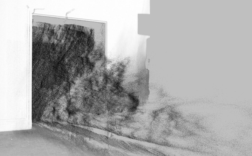 [Images: From
  [Image: From
 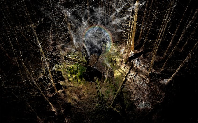 [Image: From
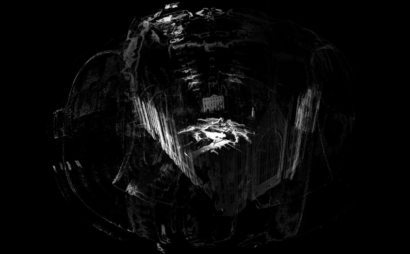
 [Images: From
 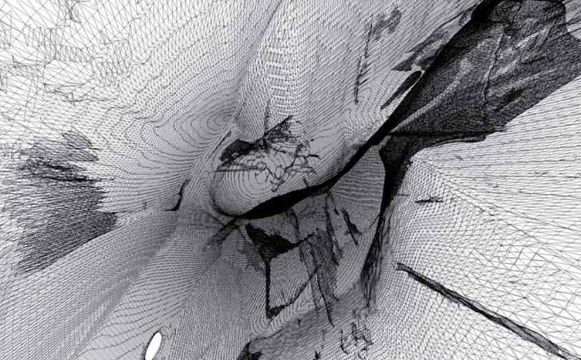 [Images: From
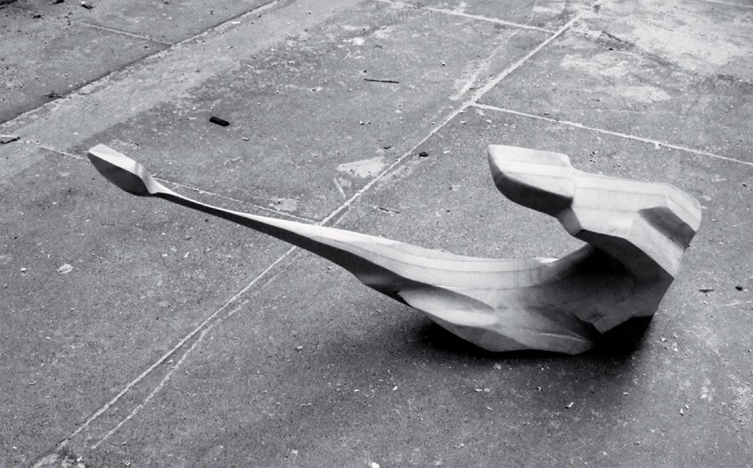
 [Images: A hypothetical "stealth object," resistant to laser-scanning, by ScanLAB].