Tuesday, December 07. 2010
Decontextualized Formalism: Form+Code
Via Vague Terrain
-----
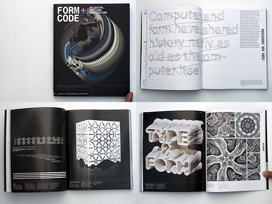
In creating a foundational piece of software infrastructure Ben Fry and Casey Reas have done myself and countless peers a great service and helped launch thousands of arty new-media applets. In Form+Code (F+C) Reas teams up with Chandler McWilliams and LUST design studio to produce a slim introductory text on procedural and code-influenced art and design. While the book makes only the briefest mention of Processing, a good percentage of the work documented in it can be traced directly or indirectly to the platform that emerged from the MIT Aesthetics and Computation work group. F+C also includes historical precedents, from loving documentation of green Cathode Ray Tube Spacewar!, to one of Sol LeWitt's wall drawing instruction cards (presented here as code only — LeWitt's typed out gallery proposal). There are a few other nods to post-minimalism and other pre-P5 projects. Additionally, F+C also breaks out of the screen-based ghetto, including images from proposed and built architectural investigations, art installations, design prototypes and sculptures.
The book itself is broken down into conceptual chapters that explore techniques that are code-like or only practically achievable with code-based tools: repetition, geometric transformation, parametrization, visualization, simulation. Each chapter includes spare descriptive pages which introduce overall themes and very briefly discuss the documented projects. F+C is a fairly no-nonesense machine -- it moves briskly through its functional structure of chapters, never pausing to dwell on any one project or image. Yoshi Sodeoka's 2004 video work based on presidential State of the Union addresses is presented in much the same way that Marius Watz's beautiful software generated abstractions are. Both sit alongside a Rafael Lozano-Hemmer installation, an elegant Cory Arcangle data-vis deconstruction, images of a Morphosis tower project for Paris, news-stream visualizations, and Mark Lombardi inspired diagramming. To some extent all these projects (and many others) are being stripped mined for the illustration of a technique or concept. This undifferentiated treatment of a really diverse set of work and ideas is, for me, the primary weakness of the book.
Even with some notable omissions in the projects covered, there's likely to be a items here most of us haven't seen yet – I discovered many. If you are looking for an overview and introduction, or a catalog of interesting work, Form+Code will be a useful resource. Ultimately, though, it leaves me hungry for a more focused and critical approach to this incredibly interesting subject. It's clear that Reas, McWilliams and LUST would be particularly well qualified to produce exactly that sort of text.
Personal comment:
The more and more code based / behavioral design, documented and commented here in this new book by Casey Reas et al.
Friday, November 26. 2010
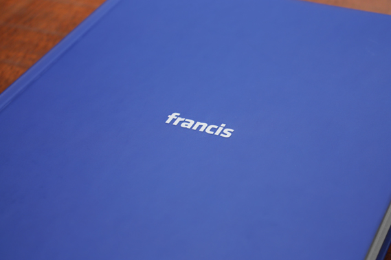
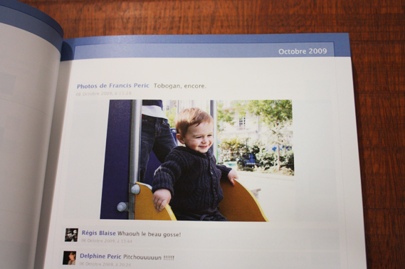
The analogue Facebook
In a promotion for French telecommunications company Bouygues Télécom, DDB Paris recently devised a way to take your Facebook profile offline...
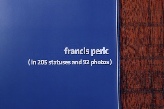
The agency realised that while people may share their most treasured memories and photographs via Facebook, the constantly changing nature of the site means that they can quickly be forgotten, or lost amongst the amount of info stored in a profile. So Bouygues Télécom created the option of turning your Facebook profile into an actual book.
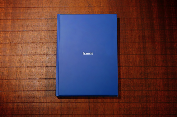
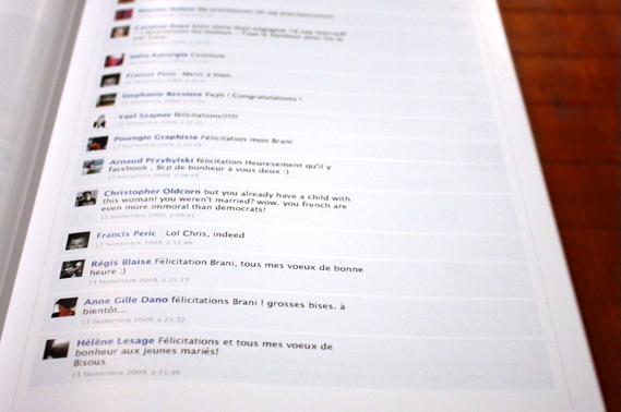
Participants could pick up to ten friends to include in their book, and also pick the timeframe covered, whether it be a birthday, wedding or other significant event. As these images of Francis Peric's book show, the styling of the books were also thoroughly in keeping with Facebook's look. The application was a huge success, with the limited edition run of 1,000 books all requested within one hour.
Credits:
Agency: DDB Paris
Exec creative director: Alexandre Hervé
Creatives: Siavosh Zabeti, Alexander Kalchev
Friday, November 19. 2010
69 année conceptuelle


En présentant cette sélection de livres d’artistes réalisés pour la plupart entre 1968 et 1971 dans la mouvance de l’art dit conceptuel, il s’agit de tracer en filigrane, le portrait de Seth Siegelaub qui a joué un rôle déterminant dans l’évolution du livre d’artiste, qui à la fin des années 60 est en pleine émergence.
L’originalité de Seth Siegelaub, c’est d’avoir édité, dès 1968 plusieurs catalogues qui se revendiquent comme l’exposition et non comme un supplément ou une illustration de celle-ci. Le livre est le lieu même où vont se déployer des œuvres originales, conçues à l’occasion de cette publication. Siegelaub ne s’intéresse pas particulièrement à ce médium pour des raisons de bibliophile mais plutôt parce que celui-ci apporte des réponses aux différentes interrogations que lui pose alors son rôle de diffuseur d’art.
En 1968, le monde est secoué par de violentes manifestations qui ne seront pas étrangères à l’évolution des avant-gardes artistiques. A cette époque, les artistes ont une défiance générale vis-à-vis de l’objet comme aboutissement de l’œuvre, de son existence matérielle et de sa valeur marchande. Ils s’opposent, consciemment ou non, aux conceptions capitalistes régnantes et remettent en cause la propriété privée. Le livre est alors une façon de rapprocher les artistes et le public sans passer par l’intermédiaire du musée ou de la galerie, d’échapper à tout ce processus marchand et de déjouer le contrôle, même sous jacent, de toutes ces institutions.
Cette exposition donne également un aperçu plus vaste sur la production de livres d’artistes à une époque charnière. Bien que l’accent soit mis sur les artistes “conceptuels” ou “minimalistes” (ceux “défendus” par Siegelaub, comme Sol LeWitt, Lawrence Weiner , Joseph Kosuth, Robert Barry…), de nombreux autres artistes américains et européens sont aussi présentés.
Télécharger le texte de Jérôme Dupeyrat : “exposer, publier…”
Télécharger la liste des ouvrages exposés
24 novembre 2010 – 12 février 2011
Médiathèque des Abattoirs, Toulouse
Friday, November 12. 2010
Klas Ernflo
Via It's Nice That
-----
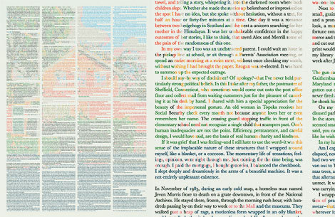
I have been utterly seduced by this piece from Stockholm’s Klaus Ernflo. I (like you) am still kicking myself for not thinking of it first, such a simple idea incredibly well executed – a story with its words coloured to create an image about that piece of writing. How nice would a whole series of these be?
Related Links:
Monday, October 11. 2010
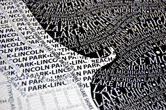
Typographic Maps: Artful Maps Made Entirely of Type
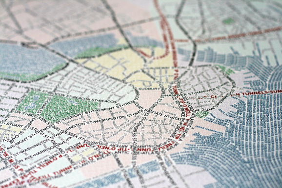
Axis Maps' new Typographic Maps are sheer cartographic beauty. The streets, cities, bodies of water, neighborhoods, and highways on each map are depicted entirely with words, and each map took hundreds of hours to complete.
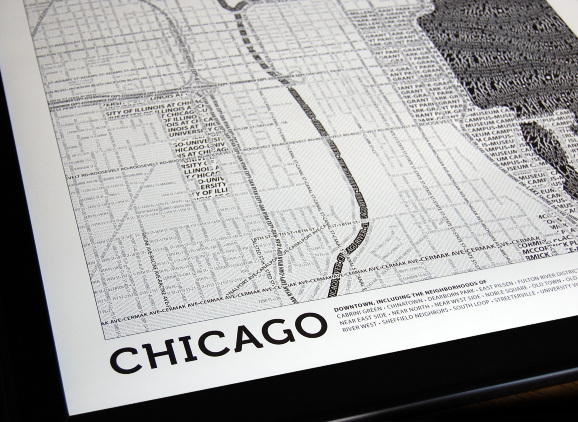
You can purchase poster-sized prints for $30 each.
Wednesday, October 06. 2010
Evil People in Modernist Homes in Popular Films
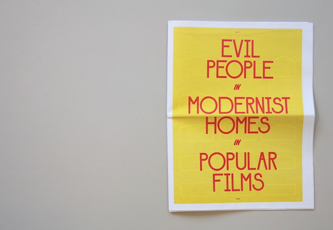
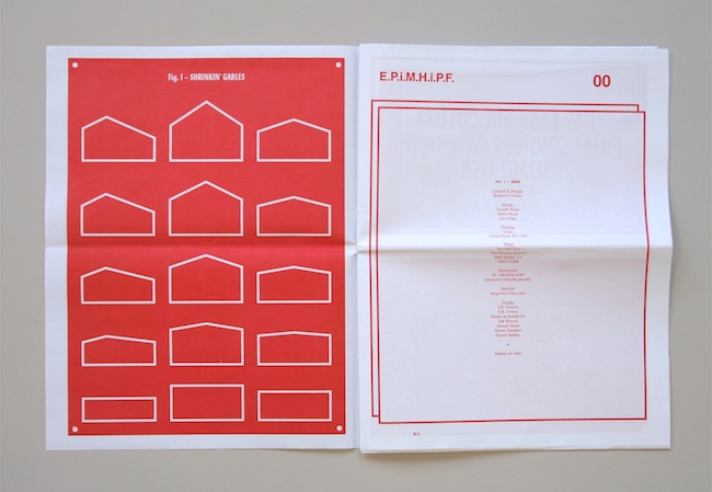
Evil People in Modernist Homes in Popular Films
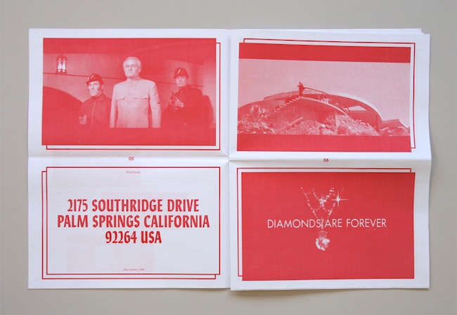
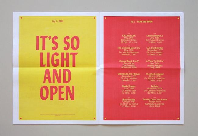
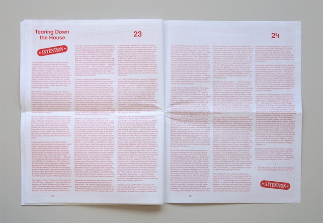
“Evil People in Modernist Homes in Popular Films (Vol. 1) is a combination viewing list, star map, and catalogue, begat from a series of screenings held at the Yale School of Art during the Spring of 2010. The publication suggests the formation of a tentative filmic canon in which modernist homes are used by filmmakers as containers for immorality and vice. Essays by John Yoder and Joseph Rosa are paired with several illustrations as well as highlights from eight films that employ the trope, including The Damned Don’t Cry (1950), Diamonds are Forever (1971), Blade Runner (1982), Body Double (1984), Lethal Weapon 2 (1989), L.A. Confidential (1997), The Big Lebowski (1998), and Twilight (2008).”
Benjamin E. Critton
Printed in a tabloid format in red and yellow ink, Evil People in Modernist Homes in Popular Films offers a serious but lighthearted investigation of the representation of Modernist architecture in popular film, reflecting on the convention of associating evil characters and events with Modern buildings, and also, more generally, on the relation between cinema and architecture. A series of texts point to examples in the James Bond films, Ridley Scott’s Blade Runner, Ang Lee’s The Ice Storm, and many others, accompanied by plentiful film stills.
Wednesday, August 18. 2010
Rumors of the Web's Death Have Been Greatly Exaggerated (with Infographics)
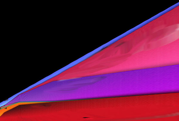
While reading Wired's recent feature, "The Web is Dead. Long Live the Internet," Boing Boing's Rob Beschizza took issue with the following infographic, which illustrates the claim that the web is dead based on the total proportion of internet traffic instead of total overall use.
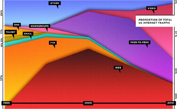
If you went with total useage, the graph might look like this:
"In fact," Beschizza writes, "between 1995 and 2006, the total amount of web traffic went from about 10 terabytes a month to 1,000,000 terabytes (or 1 exabyte). According to Cisco, the same source Wired used for its projections, total internet traffic rose then from about 1 exabyte to 7 exabytes between 2005 and 2010."
Now, using actual total traffic as the vertical axis, Beschizza reimagines the graph like this:
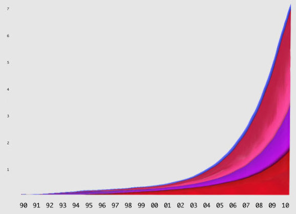
Does that look like "death" to you?
Personal comment:
Besides the point about web's death (we are speaking here about the "death" of a web of pages, but the increase in the spread of Internet usage) that was made by Wired as an editorial ad. and (apparently rightly) disputed here by Rob Beschizza, it is also interesting to see how far an information graphic can deceive its readers depending on what value you put on which axis...
It's an obvious point, I know... but nonetheless what we do with data and how we visuaklie it are becoming so important nowadays that we have to be really aware of that and don't take any fancy data graph for granted.
Wednesday, July 21. 2010
Aaron Rayburn
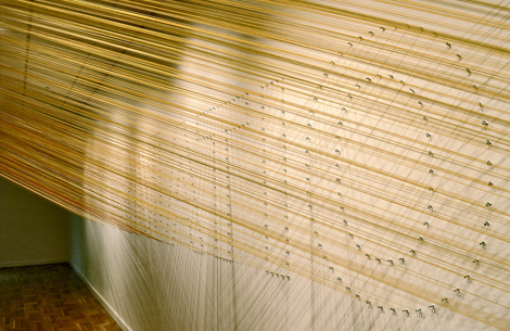
Aaron Rayburn and a band of seventeen other Portland-based creatives set themselves the task of creating a collaborative project as a single unit, and the results are magnificent. Their outcome, on display at the Littman Gallery is a giant piece of type using 14.2 miles of string, outlining 25 letters on 2,500 eyelets, strung by hand. Aaron explained things a little more, and also sent us through some more pics… (Read more)
Related Links:
Megan Geckler: Every Move You Make, Every Step You Take Exhibition
Via ArchDaily
-----
 The work of Los Angeles-based artist Megan Geckler lies somewhere between art and design, with architectural installations that are assembled from thousands of strands of multicolored flagging tape, a plastic ribbon typically utilized by surveyors to demarcate space on construction sites.
The end result resembles an updated three-dimensional version of string art that shares the seemingly kinetic territory of the Op Art and Light+Space movements. These site-specific projects are also strongly influenced by minimalism, but retain a sense of play and delight.
The exhibition will be on display at the Pasadena Museum of California Art, 490 E. Union Street, Pasadena CA , from July 17 till October 31. More information can be found here.
Related Links:
fabric | rblg
This blog is the survey website of fabric | ch - studio for architecture, interaction and research.
We curate and reblog articles, researches, writings, exhibitions and projects that we notice and find interesting during our everyday practice and readings.
Most articles concern the intertwined fields of architecture, territory, art, interaction design, thinking and science. From time to time, we also publish documentation about our own work and research, immersed among these related resources and inspirations.
This website is used by fabric | ch as archive, references and resources. It is shared with all those interested in the same topics as we are, in the hope that they will also find valuable references and content in it.
Quicksearch
Categories
Calendar
|
|
April '24 | |||||
| Mon | Tue | Wed | Thu | Fri | Sat | Sun |
| 1 | 2 | 3 | 4 | 5 | 6 | 7 |
| 8 | 9 | 10 | 11 | 12 | 13 | 14 |
| 15 | 16 | 17 | 18 | 19 | 20 | 21 |
| 22 | 23 | 24 | 25 | 26 | 27 | 28 |
| 29 | 30 | |||||
