Tuesday, July 14. 2009
Glass Inc.
 2.
2. 
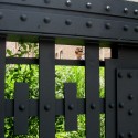
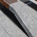
1. Joseph Paxton – Crystal Palace London, England. 1851 In the Crystal Palace, Paxton revolutionized production in the architectural process. Time for fabrication and assembly was totally reconsidered and made possible by the lightweight materials of iron and glass. A glass enveloped structure was not only lightweight, but could be produced quickly in the industrialized heart of England. The other advantage to using so much glass was a bewildering amount of daylight could be let into the massive structure, eliminating the need for massive amounts of supplemental lighting. The Crystal Palace still is a landmark project for the extent of its glass use and natural lighting.
2. Bruno Taut – Glashaus Cologne, Germany, 1914 When presented at the 1914 Werkebund Exhibition, this project received the gamut of responses from critics (Gutschow, 2006) Taut’s temporary pavilion highlighted the experiential capability of glass. Architectural historian Kai Gutschow has commented that this project transformed glass from a construction novelty to an ephemeral and inspiring material. Gutschow notes that Taut and his contemporaries, ”conjured up a utopian, visionary ‘glass architecture’ (Glasarchitektur) that was flexible and mobile, floating and towering, gleaming and transcendent, and that was allied with a modern political and social agenda.” (Gutschow, 2006) The Glashaus encapsulated the ephemeral quality of glass, moving beyond the industrial showcase of Paxton’s work. An ability to astound and bewilder with the refraction and color of glass was central to the Glashaus and remains a strong selling point for glass today. No one before Taut was able to bring such a experience to bear in a single place.
 4.
4. 
3. Mies Van de Rohe – Glass Skyscraper Unbuilt 1921-22 The cultural experience of the Chicago Tribune Tower competition of 1922 highlighted a prevalent conservative architectural tendency. The selection of a skyscraper designed to take the form of Gothic-pastiche, enraged many architects and critics. During the midst of this debate Mies produced his drawings for the Glass Skyscraper. His rejection of historicist form for a newly invented typology, the skyscraper, presented the revolutionary vision that the Tribune Tower had not. . Created before his major built works in Stuttgart and Barcelona, Mies’ conceptual drawing pioneered new ideas on transparency. A skyscraper should be as pronounced in its transparency as in its height. As workers ascend to the higher stories, so too should there be an increase in the ability to see beyond the drab of street and view the wider world. The promise of a socialist and machine driven society, where transparency symbolizes equality, shines so brightly in these drawings. The revolutionary politics of the glass skyscraper have passed, but the paradigm of a skyscraper typology requiring transparent cladding still dominates modern construction.
 6.
6. 5. SANAA - Glass Pavilion Toledo, Ohio. 2006 Bringing about the first major shift in considering glass in nearly a century, SANAA reconsidered the rules of glass at this building in Ohio. Instead of expanding the dialogue about the transparency of glass, this project is an examination of its opacity. Thin glass used for nearly all internal walls bends and curves to form rooms and corridors. As these curves bend in, the light also bends and refracts. Visitors glimpse across the space, but are obstructed from seeing the full picture. SANAA’s forms give sensuality straight from Corey Hart’s Sunglasses at Night. The mystery is not from total obstruction, but by using a simple glass manipulation against the surrounding light to create opacity.
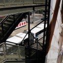
6. Halcrow Yolles/SOM – Sears Tower Observation Deck Chicago, Illinois. 2009 As discussed, the conceptual ideas on transparency in this project are not new. Excitement is not even because of an innovative material property. The material efficiency of the structural glass at the Sears Tower is impressive; however, Apple Stores and other installations have been experimenting with this process for years, so even this is only moderately innovative. What the Sears Tower project does innovate on is a marketing sense. Glass boxes and stairs at Apple Stores are impressive, but not monumental. Despite the architectural wonder of SANAA’s work, it is doubtful that many people understand its deeper significance. These obstacles of surprise and significance are overcome by the Sears Tower project because of the precipitous drop over which they are placed. The material itself is not so significant as the experience of finally being part of a death defying experience. No doubt the acrophobia is more impressive than the architecture. Marketing this, rather than revealing new ideas about glass is the underlying topic of the NY Times article and the Sears Tower’s ad campaign. Childlike amazement at standing ‘precipitously’ will no doubt attract more visitors and queries than other of these other architectural achievements. That alone should make the Sears Tower’s designers very happy. See the NY Times articleand attached photos for more information.
Gutschow, K. (2006). From Object to Installation in Bruno Taut's Exhibition Pavilions. Journal of Architectural Education , 59, 63-70.
-----
Via Jargon
Related Links:
Personal comment:
Du fait que l'on utilise pour l'instant souvent le verre dans nos projets, intéressant de se replonger dans une "short history" du matériau et de son utilisation dans des projets de "statement".
Monday, July 13. 2009
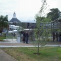
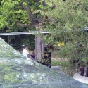
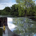
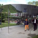
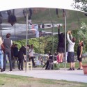
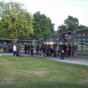
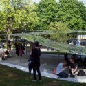
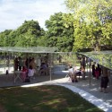
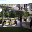
Opening day at the Serpentine Gallery Pavilion 2009

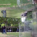
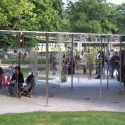
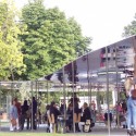
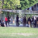
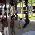
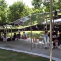
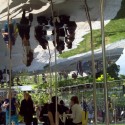
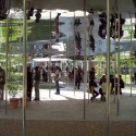
Photo by Javier Vergara Petrescu
Yesterday we featured Iwan Baan’s photo set for the Serpentine Gallery Pavilion 2009 by SANAA.
Now, we bring you a photo set from today, at the opening of the pavilion by Javier Vergara Petrescu, on which we can see more of the spatial relations at the park and the effect of the reflective material. See how the height varies creating different spaces, from a tall open space for a crowd, to a low intimate space at the end.
More photos after the break:

Photo by Javier Vergara Petrescu

Photo by Javier Vergara Petrescu

Photo by Javier Vergara Petrescu

Photo by Javier Vergara Petrescu

Photo by Javier Vergara Petrescu

Photo by Javier Vergara Petrescu


-----
Via ArchDaily
Related Links:
Personal comment:
Nice and nicely done!
Friday, July 10. 2009
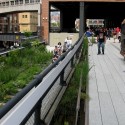
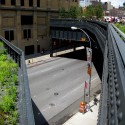
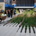
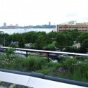
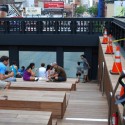
First Hand on the Highline

Photo by Karen Cilento
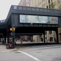
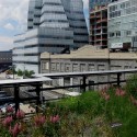
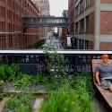
The New York Highline, a project by James Corner Field Operations with the collaboration of Diller Scofidio + Renfro has been open to the public for a few weeks (as we reported previously on AD) and as a New Yorker who has waited patiently for the project to finish, I was anxious to stroll along the latest addition in Manhattan. The visit was a completely new way to experience the city. Just the idea of observing Manhattan by walking above (and through) it, rather than being an actual part of it, made the Highline a project one must encounter to feel what the space can offer.
More about some impressions after a visit to the Highline and more pictures after the break.

Michelle Borth
Entering on Gansevoort Street, I was greeted by papers being thrust in my hand as protesters quickly explained that the wood on the Highline was taken from an endangered Amazon rain forest. The protestors were trying to prevent the remaining parts of the project from being made with this material and thus tried to raise awareness by handing out fliers and talking to those about to walk up the main stairs. It is interesting to note that the Highline’s official website refutes these attacks by explaining, “The Ipe wood used on the High Line was chosen for its longevity and durability, and taken from a managed forest certified by the Forest Stewardship Council, which is recognized for creating and enforcing the world’s strongest standards for forest management. FSC membership requires conservation of biological diversity, water resources, soils, and fragile ecosystems and landscapes to maintain the integrity of the forest and discourage exploitative deforestation.”

Michelle Borth

Karen Cilento
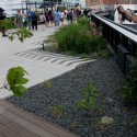
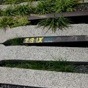
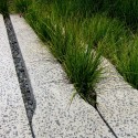
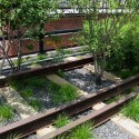
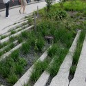
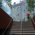
After passing through the protesters, the main entrance stands invitingly and allows light to channel down the stairway. As I walked up this great entrance, I couldn’t rid my mind of how unfair it is that a handicapped person would never be able to experience this space (much farther down the line, on 16th Street, a small glass elevator is haphazardly plopped on the side of the line). Once up the stairs, the chaotic streets seem to fade away as the overgrown landscape dominates the setting. The perfectly arranged grass and flowers, growing between and over the tracks, creates patterns of varying heights, colors and textures. The original tracks, complete with their old writing and graffiti work, show that the architects truly embraced the past and incorporated it into its present condition. The compositional quality of the landscape transforms the whole atmosphere making it entirely different from the portion just down a few stairs.

Karen Cilento

Michelle Borth
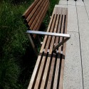
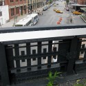
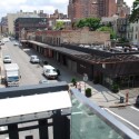
The beginning parts of the Highline are beautifully designed. The overall aesthetic is very simple and yet, flexible as a variety of benches and seating are all different and yet all seem to belong. Handrails are engraved with the streets numbers, providing a map to those walking along. And, the walk provides perfect views of the Empire State Building, the Hudson River and Gehry’s IAC Headquarters. On the downside, there are also spectacular views into people’s apartments, galleries and conference rooms, as well as the exposed, and unappealing, meatpacking factories and rundown buildings. People walking along the line can come face to face with those changing their infant or interviewing their newest prospect. In addition, large billboards are angled directly toward those on the Highline. It would be a shame if the Highline became an advertising haven constantly annoyning those walking with the latest fashions or technologies.

Karen Cilento

Karen Cilento
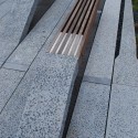
Approaching one bend in the Highline, there is an amphitheatre condition with broad stairs allowing people to sunbath, read, or be at their leisure. The amphitheatre is stepped down toward the street, so those sitting are confronted by a large glass panel that focuses on the taxis whizzing by and the people dining on the sidewalk. Although the idea to isolate a busy Manhattan street is very enticing, it is a lot like DS + R’s tactic for their Institute of Contemporary Art in Boston. Rather than isolating the water as in Boston, the architects have merely flopped the city for the water to copy the effect.

Karen Cilento

Michelle Borth
It is true that some pieces of the Highline are still very much under construction. Some stair cases are far from being close to the elegant main entrance and the area under the residential tower needs some work, but all will come together in time. There is so much potential for the surrounding areas and within a few years, the area is going to be exponentially more popular than it already is.

Michelle Borth

Karen Cilento
The Highline was bustling with life as people enjoyed sitting, lying, reading and walking in this new atmosphere. It is a successful project that highlights New York as much as the actual Highline. It is truly a great treat for anyone.

Michelle Borth


-----
Via ArchDaily
Related Links:
Personal comment:
The NYC Highline garden coming to life! Don't miss it on your next trip to the city: close to the rising "hip" neighbourhood of the Meetpacking District, it will surely become another "must go" place of NYC...
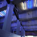
Chamber Music Hall / Zaha Hadid Architects

Luke Hayes
We just received Zaha Hadid Architects’ latest project for the Manchester International Festival. ZHA has created a chamber music hall for solo performances of Johann Sebastian Bach’s chamber music masterpieces. The project’s form, a suspended ribbon of translucent lightweight synthetic fabric (150 g/m2) articulated by an internal steel structure, translates the intricate relationships of Bach’s harmonies into an architectural spatial condition. Festival Director Alex Poots exclaimed, “Zaha Hadid Architects consistently come up with challenging and innovative ideas. It has been wonderful to see the realisation of this project and experience such intimate performances from the leading concert musicians within it.”
Further description about ZHA’s Music Hall and more images after the break.

Zaha Hadid Architects
The design of the music hall ”enhances the multiplicity of Bach’s work through a coherent integration of formal and structural logic. A single continuous ribbon of fabric swirls around itself, creating layered spaces to cocoon the performers and audience with in an intimate fluid space,” explained Hadid. The ribbon wraps around the stage, the audience and itself, creating different layered conditions by “alternately compressing to the size of a handrail then stretching to enclose the full height of the room.”

Luke Hayes
The undulating surface of the fabric shell in a “constant yet changing rhythm” creates a “soft billowing effect”. When the hall is not in use, programmed lighting and a series of dispersed musical recordings will activate the spaces between the ribbon.
In addition to the strong architectural ideas, the music hall must provide clear acoustics for those viewing the concert. “The challenge of the project was to take a gallery space primarily designed for visual art and help Zaha Hadid Architects in their vision to convert it into a modern extraordinary new performance space for chamber music,” explained Mark Howarth, a partner of Sandy Brown Associates.

Luke Hayes
“For optimum conditions for chamber music it is important to ensure that the reverberation time is not too long as this blurs individual notes so music can lose its intricacy. Equally it should not be too short as this provides a lack of response for the performer and causes the music to sound overly dry,” explained Howarth. If ZHA added too much additional sound absorptive material, the sound would loose a lot of its quality. Thus, a variety of materials were investigated, such as different fabrics, metals and plastics, to ensure that the architectural elements would not take away from the musical experience.

Tony Hogg Design and Base Structures
ZHA and Sandy Brown Associates worked together to perfect the acoustics using CAD models that were imported into acoustic modelling software that tested the different finishes and shapes of the curving form. Through this collaboration, ZHA’s curving ribbon creates both a strong architectural statement and a great acoustic environment as the form helps scatter the sound reflections to eliminate flutter echoes and enhance the acoustic experience of the concert.
Images courtesy of Tony Hogg Design and Base Structures, Zaha Hadid Architects, and Luke Hayes. All images are copyright.
For further information on all performances and events the Manchester International Festival please visit www.mif.co.u

Luke Hayes
Luke Hayes

Luke Hayes

Zaha Hadid Architects

Zaha Hadid Architects

Tony Hogg Design and Base Structures
CLIENT: Manchester International FestivalPROGRAMME: Chamber Music Hall
ARCHITECTS: Zaha Hadid Architects / DESIGN TEAM (Zaha Hadid Architects): Melodie Leung, Gerhild Orthacker
ACOUSTIC CONSULTANT: Sandy Brown Associates / FABRICATOR: Base Structures / TENSILE STRUCTURAL ENGINEER: Tony Hogg Design Ltd / SITE: Manchester Art Gallery, T1 Gallery / SITE AREA: 17m x 25m
-----
Via ArchDaily
Personal comment:
On connait maintenant le travail de Zaha Hadid, ça reste très formel -sur des justifications génératives dont on peut légèrement douter de la véracité- et il n'y a plus de véritable surprise. Mais il faut reconnaître ici que l'objet est assez "beautiful" et que l'on s'y imagine facilement écouter du Bach!
Thursday, July 09. 2009
SANAA's Serpentine Unveiled
Architects Kazuyo Sejima and Ryue Nishizawa of leading Japanese practice SANAA admire their Serpentine Pavilion, which opens to the public this Sunday
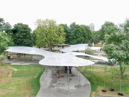
Leading Japanese architects SANAA were in attendance at the press viewing for this year’s Serpentine Pavilion, the temporary summer cafe and event space commissioned annually by the Serpentine Gallery in
In line with the brief, the pavilion is the first built structure by the Japanese practice in England. The ninth commission in the gallery’s annual architecture commission, the aluminium and stainless steel structure took just six months from contract to completion.
Speaking of the execution of their design, practice founder Kazuyo Sejima said, ‘The reality is more beautiful than I first imagined’.
The structure, whose free and open design co-founder Ryue Nishizawa described as, ‘a non-architecture idea, such as a rainbow or water,’ will be open to the public in Kensington Gardens until 18 October, before being sold to a private buyer.
Serpentine Gallery director Julia Peyton-Jones said that the pavilion, located just outside the gallery’s home in Kensington Gardens, ‘becomes the public’s town square’ for its three-month stay.
Previous designers include
-----
Related Links:
fabric | rblg
This blog is the survey website of fabric | ch - studio for architecture, interaction and research.
We curate and reblog articles, researches, writings, exhibitions and projects that we notice and find interesting during our everyday practice and readings.
Most articles concern the intertwined fields of architecture, territory, art, interaction design, thinking and science. From time to time, we also publish documentation about our own work and research, immersed among these related resources and inspirations.
This website is used by fabric | ch as archive, references and resources. It is shared with all those interested in the same topics as we are, in the hope that they will also find valuable references and content in it.
