Wednesday, May 27. 2009
In-Formed: Embedding Statistical Data into Everyday Household Objects
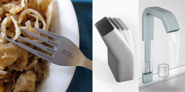
In-Formed [nadeemhaidary.com] is an impressive product design project that consists of three normal household objects which are augmented with statistical data. The aim is to seep quantitative data into the products that surround us to provide for a more intuitive context, and ultimately to create a more memorable and persuasive experience that might have the power to change people's behaviors and attitudes.
"Caloric Consumption" shows the caloric consumption per capita in various countries and regions visualized on a plate and fork. The information allows for the comparison of one's cultural eating habits with those from the rest of the world. For instance, the surface area of each of these plates is scaled in proportion to the amount of food consumed by the people who live in the region depicted on the plate. Each prong on the fork represents a different countries caloric intake per capita.
"Water Usage" is a water faucet that shows the relative amount of water consumed each time the faucet is used.
"Waste Production" consists of waste bin that measures the personal or household waste in terms of its weight in pounds. The weight of the garbage changes the angle of the waste bin, making it less inviting and giving one a visual cue as to how much trash has been thrown away.
-----
Personal comment:
Des produits contenant des informations, en lien avec la fonction du produit.
Obama One People: Revealing the Emotional Flow of the Presidential Inauguration
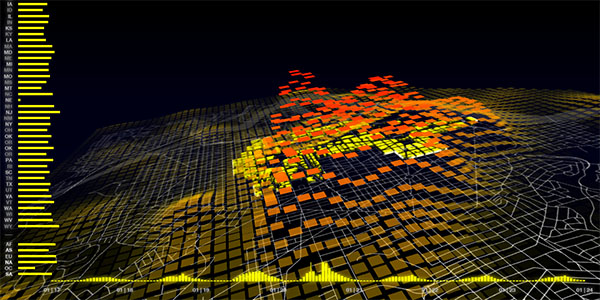
Obama | One People [senseable.mit.edu] consists of two "dazzling" visualizations that celebrate Barack Obama and the people who supported him from all over the U.S. and the world. The maps are based on mobile phone call activity that characterize the inaugural crowd and answer the questions: "Who was in Washington, D.C. for President Obama's Inauguration Day?" and "When did they arrive, where did they go, and how long did they stay?"
The data analyzed consists of hourly counts of mobile phone calls served in Washington, D.C. and includes the origin of the phones involved in the calls. The map of Washington, D.C. is overlaid with a 3D color-coded animated surface of square tiles (1 tile represents an area of 150 x 150 meters). Each tile rises and turns red as call activity increases and likewise drops and turns yellow as activity decreases. On the left, a bar chart breaks down the call activity by showing the normalized contributions of calls from the 50 states and 138 foreign countries grouped by continent. The timeline at the bottom illustrates the overall trend of call activity in the city during the week of the Presidential Inauguration.
"Examining the relative increase in call activity by state reveals some unexpected results. The states with the strongest increase were the southern states of Alabama, Georgia, Kentucky and Tennessee, with calls up to twelve times the normal levels. These are states that played a prominent role in the Civil Rights movement and notably are also so-called red states whose voting population went for the Republican candidate, John McCain. Other states with a ten-fold increase in call activity were Illinois, Barack Obama's home state, and Michigan, Ohio and Indiana, swing states which went blue, voting for President Obama. Most interestingly, comparing these results with U.S. demographic statistics shows that the percentage of African Americans in each U.S. state is a predominant factor determining increase in call activity and therefore participation in the event, which instead was not necessarily influenced by the state's proximity to Washington, D.C. or its political leaning." Other data analysis findings are described here.
Watch the three accompanying movies below.
See also World's Eyes: Mapping the Visual Traces of Tourism in Spain, Senseable City of New York, Real Time Rome and Mobile Phone Landscape Graz. Via datavisualization.ch.
-----
Personal comment:
Une cartographie "d'activité" de la ville (utilisation de téléphones portables lors du discours d'inauguration de B. Obama) qui révèle des "patterns" à priori invisibles. Ce type de visualisation de données extraites de la ville, développant de nouvelles cartes, une sorte d'"algorythmique du réel" (reality computation) va se développer de plus en plus, sur tout type de données.
Tuesday, May 26. 2009
FAX
FAX, an exhibition that invites a multi-generational group of artists, as well as architects, designers, scientists and filmmakers, to conceive of the fax machine as a thinking and drawing tool. Participants will transmit fax-based work—some seminal examples of early telecommunications art—via the museum’s working fax line throughout the duration of the exhibition. The active accumulation of information—received in real time, in the exhibition space—will include drawings and texts, and the inevitable junk faxes and errors of transmission, creating an ongoing cumulative project concerned with reproduction, obsolescence, distribution, mediation, and generative systems.
Faxes by close to 100 participants sent to the initial showing of FAX at The Drawing Center will form the core of this generative and accumulative exhibition; and subsequent institutions will each invite up to twenty additional artists to submit works to be presented at successive venues as a touring exhibition.
Participating artists include: John Armleder, Tauba Auerbach, Pierre Bismuth, Barbara Bloom, Mel Bochner, Jan De Cock, Peter Coffin, Cerith Wyn Evans, Morgan Fisher, Aure?lien Froment, Ryan Gander, Liam Gillick, Joseph Grigely, Wade Guyton, Charline von Heyl, Matthew Higgs, Germaine Kruip, Glenn Ligon, Dr. Ronald L. Mallett, Josephine Meckseper, Olivier Mosset, Steven Pinker, William Pope.L, Seth Price, Pamela Rosenkranz, Dexter Sinister, Wolfgang Tillmans, Edward Tufte, and Christopher Williams, among others.
Until July 23 2009
Drawing Center, in the Drawing Room
New York
-----
Via ManyStuff
Personal comment:
Vielle technologie et projet de design/art "communiqué", transmis. Me rappelle un projet d'architecture réalisé avec Pieter Versteegh & Bruce Dunning où l'entier du processus s'était fait comme ça: transmission de dessin entre CH et US et design à 4 mains plus une machine!
Wednesday, May 20. 2009
Daniel Widrig


Quelques images extraordianires.
Some extraordinary images.
Sources: Daniel Widrig
-----
Related Links:
Personal comment:
Très formel et biologiquement inspiré, probablement génératif. Egalement une architecture ou des volumes de "patterns", de motifs. cela me fait penser aux récents projets de R&DSV & Sie, également "bio-inspirés". Il y a quelquechose d'intéressant dans le fait qu'on ne sache quelle sont les échelles de ces objets/maquettes: grand ou infiniment petit. Cela provient certainement d'une double lecture: formes génératives évoquant le petit, le biologique, la cellule et assemblages de formes évoquant l'architecture, l'urbanisme.
Et effectivement (voir la galerie d'image), Daniel Widrig pense ses projets à toutes échelles, une forme pouvant aussi bien être un bâtiment qu'un siège ou une petite sculpture.
Mais est-ce que cette approche fonctionne?
Visualizing the Major Health Issues Facing Americans Today
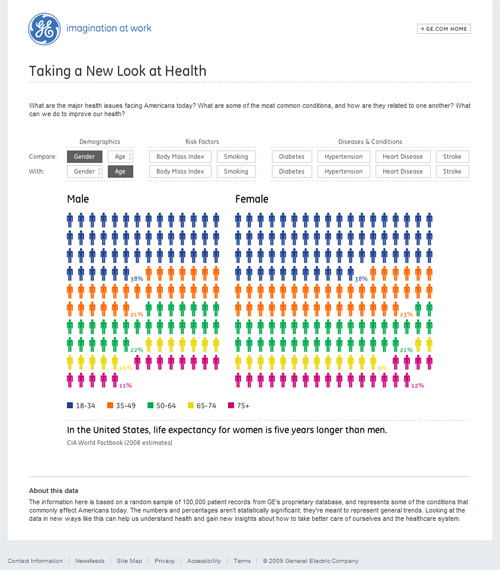
Ben Fry and Phyllotaxis recently released this impressive online visualization that shows the statistical connections between related medical conditions. The Health Visualizer [ge.com] focuses on the major health issues facing Americans today, by allowing users to compare demographics (i.e. gender, age), risk factors (i.e. body mass index, smoking), diseases and conditions (i.e. diabetes, hypertension, heart disease, stroke).
While the visual and the animations seem simple at first sight, the real strength lies in empowering users to explore the many (often causal) relationships between different sets of statistical data in an intuitive way.
-----
Related Links:
Personal comment:
Un site et une application (probablement réalisée avec Processing, du fait qu'il s'agisse du designer Ben Fry) en rapport avec des données sur la santé aux Etats-Unis (dont la cigarette). Le site est relativement simple mais l'application bien faite. Un graphisme d'information.
fabric | rblg
This blog is the survey website of fabric | ch - studio for architecture, interaction and research.
We curate and reblog articles, researches, writings, exhibitions and projects that we notice and find interesting during our everyday practice and readings.
Most articles concern the intertwined fields of architecture, territory, art, interaction design, thinking and science. From time to time, we also publish documentation about our own work and research, immersed among these related resources and inspirations.
This website is used by fabric | ch as archive, references and resources. It is shared with all those interested in the same topics as we are, in the hope that they will also find valuable references and content in it.
